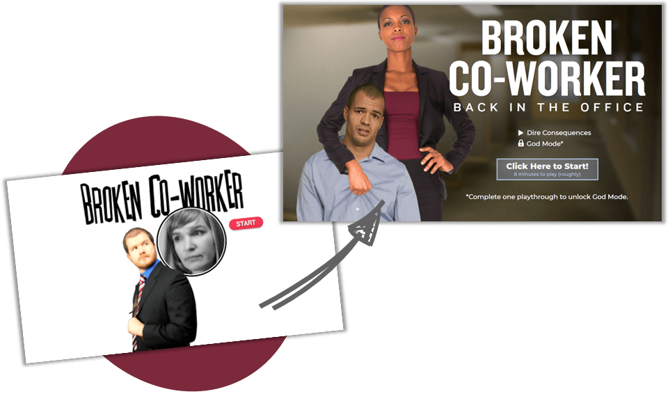
Broken Co-worker Interactive Story Example for eLearning
Storytelling Graphics Made Easy
Interactive stories can be built on a budget, using the skills you already have. No video or fancy graphic design required!

The original Broken Coworker by Anna Sabramowicz and Ryan Martin of eLearningSecrets.com stands as one of the most well-known projects in our industry for a reason. It’s a masterful story-based learning experience that is both inspiring and aspirational.
Still, as attractive as it is, most instructional designers who have viewed it over the years have likely judged the project as being something they could never create due to limited production time and budget.
Recently, Ryan challenged himself to prove that judgment wrong, and he built an updated version of Broken Coworker. The latest version showcases how a compelling story can be matched with an engaging visual experience that is well within reach for any instructional designer.
Let’s take a closer look at how Ryan made it happen.
Great stories engage your viewer. Try the “Visual Novel” approach

Taking a cue from video games, Ryan leveraged a framework called the “Visual Novel.” As we view the project, we’re drawn into the story, feel empathy for the main character, and want to rescue him from the villain.
In addition to the short and snappy scripting, two cutout photo characters are used to convey real emotion – he’s the picture of hassled and worried while she’s sinisterly gleeful – to add depth to the story.
Viewers are set into each scene through the use of simple establishing shots that soon become the locations for each of the challenges the protagonist must face. Then just as the tension builds, and we’re wondering what will happen next, the project stops and asks us to help the poor guy out. Boom! THAT is engagement!
Simple visual design delivers the story. Start with eLearningArt characters and backgrounds to get the job done.

The new version of Broken Coworker sports a simple-to-build visual design. Just two types of eLearningArt photo assets complete the look: Cutout photo characters and photographic backgrounds.
Ryan has displayed these on each slide in a simple and straightforward way, placing the sequenced characters over scene-specific photo backgrounds with an easily-repeatable text display.
There’s no video. No actors. No editing. And no fancy graphic design styling. Just the way it should be for on-time, on-budget elearning programs, right?
With your graphics a slam dunk, you have time to nail the scripts and interactions

Ryan’s use of simple design approaches – each one well within reach for those of us who build learning every day – offers a master class in efficiency.
Production-friendly approaches in the new Broken Coworker version include:
- Swapping in cutout characters for live actors
- Sequencing simple scenes limited to just characters and backgrounds
- Telling the story from just one character’s perspective, and simplifying the dialog structure
- Using readable text instead of recorded audio
- Repeating the structure and layout of each interaction
As an added benefit, these approaches open up hours of project time that can be used to write engaging scripts and interactive experiences.
Build a learning experience your audience will love to engage with, and have fun doing it!

The new Broken Coworker project shows that you don’t need to be (or hire!) an expert videographer or a graphic designer to create an experience that delivers real engagement.
With an emphasis on compelling scriptwriting matched with simple but effective graphics, this type of course can be both fun to write and build. Even better, it’s also lots of fun to learn from.
A little direction on the Visual Novel framework, access to a strong graphics library like the one you’ll enjoy as an eLearningArt member, and the use of a rapid authoring tool such as Articulate Storyline are all that’s required.
That means engaging story-based learning like the new Broken Coworker is yours to build, starting today!
If you’re looking for something that’s way more fun to build (or take) than your standard click-through elearning course, and has an off-the-charts engagement-to-production time ratio, check out Ryan’s free training on how he built this updated version of Broken Coworker using the Visual Novel framework.
eLearningArt assets featured in this article: Photo cutout characters from business casual (Julie and Kevin) and disability (Jeanette with crutches) collections, photo backgrounds (office exterior and interiors), and cutout photo objects (laptop).

