If you’re building a good eLearning course, you don’t want to cover EVERYTHING (even if your SME tells you that learners need ALL the information in the history of mankind).
You’ll highlight the important stuff, like what do DO with the information and how to connect the learner to outcomes. And then you’ll link out to other resources and information.
So you’ll need a page where you can link out to additional info…That’s where the resource screen comes in.
I’ll also show you how I built this template and walk you through my thought process with building and using resource screens.
How to create your own resource page
I thought we’d just jump right into how I built the design of the free resource template.
There are four steps to designing the resource page:
1. Design a background
I design my backgrounds in PowerPoint, then import them into whatever authoring tool I need. Here’s a quick lesson on how I designed the giveaway file using only PowerPoint and shapes.
2. Design category containers
Again, I like to design the categories in PowerPoint. The icons I used were PNG images. I could have also used icons developed in PowerPoint for full control over the design.
3. Add your text
If you’re designing on a single screen, you’ll just add the text for the the downloads right there on the one slide, like this:
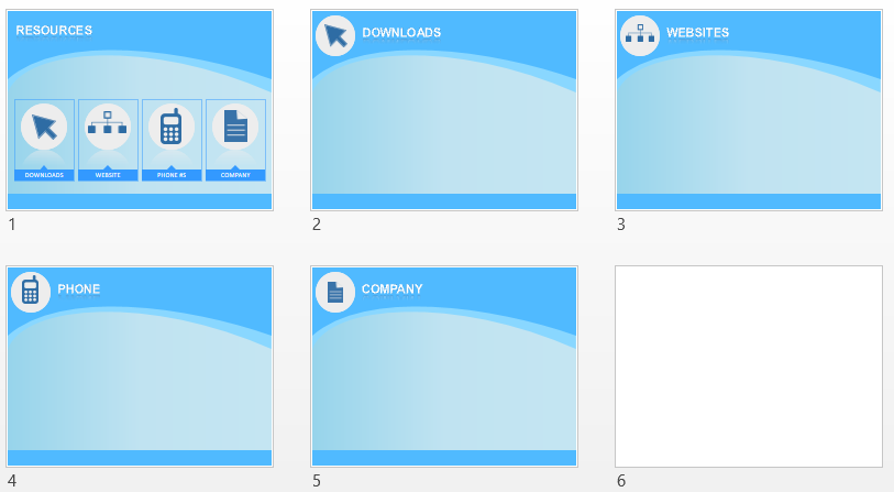
If you had more of a category structure, like in the giveaway file, you’ll want to create additional placeholder pages that carry the the the theme through, like below. And then you’ll add your text to that.
4. Create your hyperlinks
In PowerPoint, you can link to anything, not just text. For example, If I used the 5 slides above, I could link out from the main slide to each category page.
I could also link to external pages.
Here’s a quick lesson on how to link to anything in PowerPoint.
In addition to category pages and external pages, you’ll also want to go back and create the links to the actual files. That’s kind of important 😉
6 Questions to ask when designing a resource slide
I’ve also laid out the 6 the questions you should ask yourself when creating a resource page for an eLearning course below.
1. What information are you linking to?
You probably have a sense of the all the resources you want to include. It’s time to do a data-dump…. Just list every resource you can think of that would be helpful.
2. Is there a logical grouping?
There are some common types of resources that you could be linking to, such as:
- Downloads
- Internal site links
- External websites
- Phone numbers
- Additional courses/lessons
- Manuals
- Company pages
- etc
Put each of the resources from step 1 into one of the grouping above. Feel free to create your own group titles.
3. Is there an icon that represents that group?
I’m sure the answer is yes. There is an icon to represent everything. If you’re an eLearningArt member, our library has a lot of icons. But there are also a ton of free icon resources on the web. Or, you can create icons yourself in PowerPoint.
4. Will all resource links fit on a single page?
I typically take one of two approaches:
- Single page: If the list is short, put everything onto a single slide under each grouping.
- Multiple pages: If you have a lot of resources, just focus on the categories on your main resource page, then have each category link to it’s own page with a list of the resources for just that category.
5. What will the design look like?
Generally, you’ll want the resource page to match the look and feel of your course. If working with a flexible template, you should be able to tweak the color scheme easily to match your course.
Or, if you’re creating it from scratch, it will be easy to match your course.
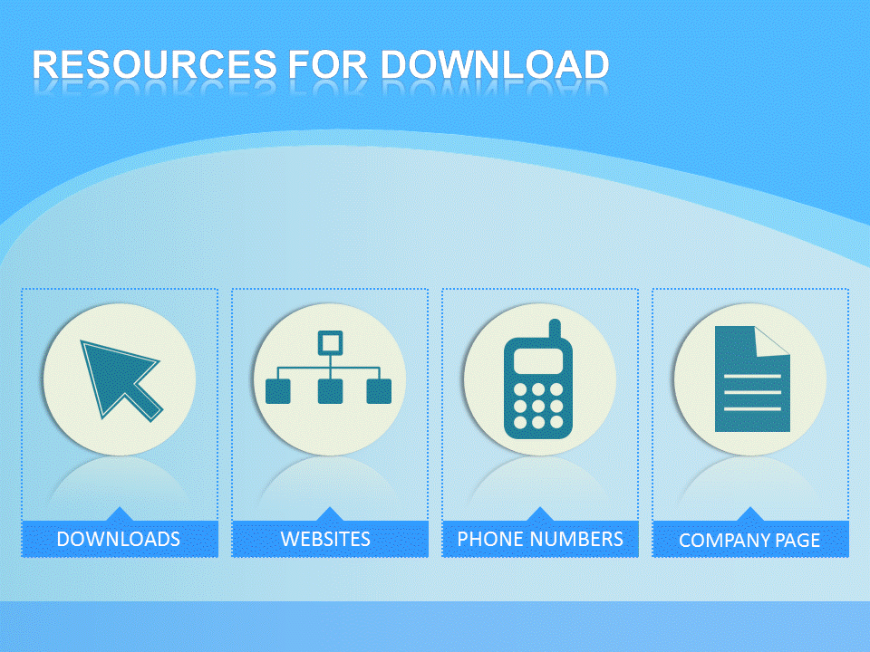
If you’re keeping to just a few categories, I suggest a horizontal layout of the categories, like this:
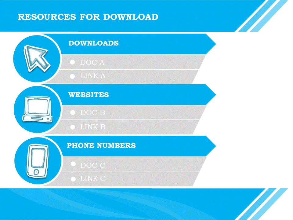
If you’re listing a lot of resources, a vertical layout makes more sense, like this:
6. How will the user access this page?
There are two logical places to put a resource page within your course:
- end of course
- dropdown
Most authoring tools will give you the option to put your resource screen in either (or both) of these places.
Next steps- Post to social please 🙂
If you found this post useful, please take 30 seconds and share it on any of the social networks by clicking one of sharing buttons on this page.
It helps new people find the resources.
Plus, it helps me understand which posts you find most useful so I can create similar types of content in the future.

