Did you know there are only 14 PowerPoint MVPs in the United States?
These are the practitioners that Microsoft designates as the top experts… the PowerPoint and presentation ninjas.
I was lucky enough to have the opportunity to interview PowerPoint MVP Ellen Finkelstein.
I asked her to share her best tips about PowerPoint, presentations, design and more.
Below is what she shared with me.
And with that, let’s continue with the these awesome tips in the interview below!
What’s your best tip for using PowerPoint more efficiently?
There are so many! I think my favorite comes from what I see my clients doing, which is starting with a blank slide and adding text boxes. The problem is that they spend hours fiddling with slide after slide and the results are messy and inconsistent. So I recommending using PowerPoint’s layouts — you’ll save time and your slides will look better.
How can a non-designer improve as a designer?
Use what I call the Tell ‘n’ Show(SM) method. Tell the point in the slide title and then show it with a relevant image, graph, or diagram. This method helps the audience understand and remember the point better and avoids Death by PowerPoint.
Keep your slides simple and consistent. Use SmartArt instead of bullets. Find powerful photos that are relevant and make them big. My book, Slide Design for Non-Designers, explains in detail how non-designers can create great slides.
Is charisma in presentations something that can be learned, or is it innate?
I think charisma can be learned. It takes being authentic. It takes having meaningful content and feeling passionate about it. Then it takes lots of practice. Get honest feedback (including from yourself, by videotaping yourself). Really connect with your audience. It will happen.
What makes a presentation persuasive?
If you have a solution to problems your audience has and you explain it clearly, your presentation will be persuasive. Just be sure not to kill them with Death by PowerPoint. Use lots of relevant images that portray the emotions you want your audience to experience. Make sure what you’re offering is high quality and a great value.
What’s your best PowerPoint tip?
Well I already gave you my #1 PowerPoint tip in your expert roundup post, which is to use the Show & Tell method. So I’ll give you a bonus tip…
Work on your script first, outside of PowerPoint. This will let you focus on your content and its organization. So, this is really a non-PowerPoint tip!
What are 3 helpful PowerPoint shortcuts that most people don’t know?
- Drag across multiple objects on a slide to select them all — everything inside the selection box.
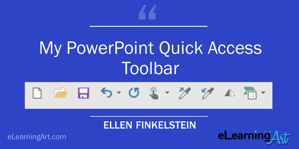
- Customize your Quick Access toolbar — the one at the very top — to include the tools you use most.
- Use Ctrl + D to duplicate objects — it’s much quicker than copy and paste.
What’s your best tip for using images more effectively?
Make them BIG! Crop them to just what you need and make them as large as possible. They’ll have more impact.
What do you have on your PowerPoint Quick Access Toolbar?
Some people have LOTS on their QAT, but my experience is that I can’t find the icon I want from among a long toolbar. I have 4 that are unique:
- Pick Up Style: This is a little like the Format Painter, but you don’t have to use it right away.
- Apply Style: This is a little like applying the Format Painter, but it works more easily on text.
- Flip Horizontal: This flips an image horizontally. I use it a lot and it’s quicker to find it on the QAT than on the Format toolbar, under Rotate
- Convert to SmartArt: I use this a lot, too. It’s on the Home tab, but if I’m somewhere else, it’s easier to find it on the QAT.
Ellen Finkelstein’s Quick Access Toolbar:
When you do a presentation makeover, what’s the most common change that needs to be made?
I reset many of the slides so that they conform to their layout. That’s because I often see wildly inconsistent slides. Then I add lots of relevant photos.
What’s one practical tip people can implement today to become better presenters?
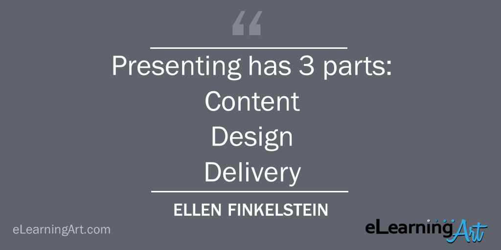
Remember that presenting has 3 parts:
- Content: Know your audience and write relevant, meaning, organized content
- Design: Use the Tell ‘n’ Show(SM) method
- Delivery: Practice and then deliver in a way that engages the audience

