Interactive Video Story eLearning Example
Photo Characters Done Really Right
It’s just fun to see eLearningArt characters doing their thing in real-world learning programs, so when our friend Kimberly Goh shared her most recent project with us, we knew you’d want to see it, too!

Kimberly, Camtasia, and ELA Characters — Wow!
Kimberly, the founder of theinteractivestory.com is all about high-engagement video-based learning. To demo the use of Camtasia as an economical development tool for interactive learning, she featured two of our most expressive business characters, Trina and Gary, locked in a tense conversation. Let’s see how she manages to build in tons of emotional oomph.

Rotating Angles for a Cinematic Feel
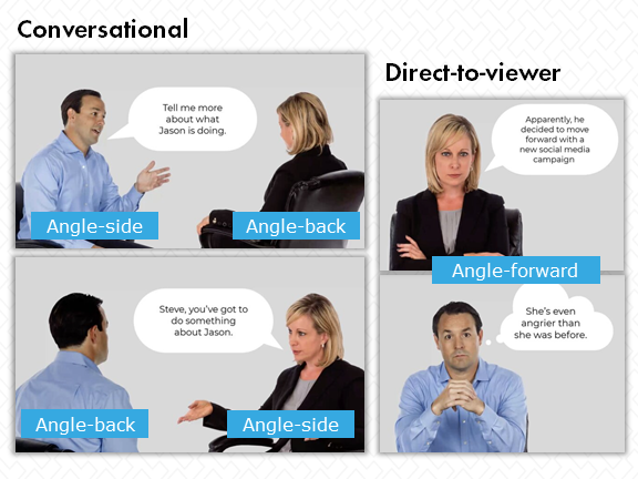
Kimberly wowed us with her spot-on use of the characters in conversational (and confrontational) angles. Just like in a live video, she shifts the perspective depending on who is speaking and chooses poses with expressive body language to quickly get each character’s points across. By mixing both conversational angles and direct-to-viewer angles, Kimberly creates both story and interaction.
Helping Us Believe the Story
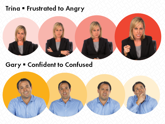
Tracking both Trina and Gary across Kimberly’s video, we not only see their frustration and confusion, but also understand the position each one is coming from. For example, we see that Trina is sure that she’s legit with her beef about “Jason,” while Gary looks like he just wants to avoid the whole confrontation. (Do you see the same thing? That’s part of the fun!) When what is on-screen carries this level of nuance, the story becomes rich and significant — and it’s more interesting to watch.


Escalating the Emotional Tension
Anger has a lot of subtleties and nuance — from slight annoyance to full blown rage. Kimberly did a great job capturing this as Trina becomes increasingly angry, and Gary gets more and more flummoxed. As viewers, we’re taken on an emotional ride right along with them, virtually guaranteeing that we’ll stay engaged until we see the outcome.
Keeping the Scene Simple
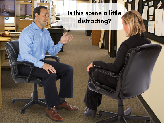
One thing that works to keep us focused on the emotions here is the lack of background distractions. When you’re developing slides, it can take some courage to keep them simple like Kimberly has done with her simple silver background, characters pulled large. The statement is clear and bold, though. For this program, our focus is meant to be on the characters, their feelings, and the choices to be made. Avoiding background noise delivers just what’s called for.

We’re so impressed by the visual solutions built into this project. Not only did Kimberly give us some great ideas for working in Camtasia, but she also managed to bring some of our favorite eLearningArt photo cutout characters to life. In just a few simple slides, Kimberly has delivered a strong learning experience that will keep viewers leaning in. Join us in giving her a round of applause!
