eLearning and Instructional Design Portfolio Examples
(and How You Can Build Your Own)
If you’re an instructional designer or elearning developer, you need an online portfolio! To make the process of creating one as easy and effective as possible, it’s best to understand what this type of portfolio is and why it’s important.
What is an instructional design or elearning development portfolio?
Your online portfolio is a showcase of the work you can do as an instructional designer or elearning developer. Just as your resume provides a summary of your work experience and job history, a portfolio provides a snapshot of your skills in executing instructional design and elearning projects. The most effective portfolios go beyond just show and tell; they are specially crafted to highlight not just what you can do, but also how you can solve the viewer’s problems.
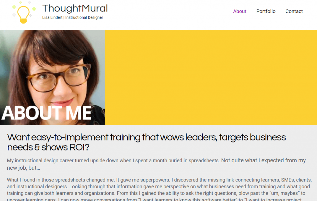
Instructional designer Lisa Lindert’s portfolio About page offers a great example of speaking directly to the challenges that are faced by her target audience. Other examples of instructional designers and elearning developers who effectively apply this approach via their About pages include Houra Amin, Colleen Griffiths, and Sophie Lanoix.

Create a portfolio that gets results!
There are 3 different approaches you can take to building a portfolio. Each will attract a different type of employer. Make sure you target the right one. Download this bonus guide before you start building so you get it right!
Why is an instructional design or elearning development portfolio important?
To put it simply, yes! Instructional designers and elearning developers both will benefit from having an attractive and up-to-date portfolio. We see five primary reasons why it’s a worthwhile investment of one’s time and energy to create an online portfolio. Here’s the list:
1. A portfolio is often requested (or required) during the hiring process.
Take a look at most any instructional designer or elearning developer job listing today, and you’ll see a request – or a requirement – for online work samples. In the highly visual field of instructional design and elearning, an online portfolio has become requisite part of the job seeker’s professional documentation.
2. A portfolio demonstrates the execution of projects, unlike a resume or LinkedIn.
Why are companies asking for online portfolios? A strong resume and a can-do LinkedIn profile tell the hiring manager how great you are, but a portfolio shows your skills in action. Your portfolio gives them an additional, visual, dimension from which to gain insight into what you will bring to the job. It lets the hiring manager see the work you actually produce.
3. A portfolio sets you apart from other candidates.
Even when the job description doesn’t explicitly require or request a portfolio, having a great online portfolio can set you apart from other candidates. An easily-accessed portfolio communicates that you’re a solutions-oriented action taker. If you were a hiring manager, wouldn’t you want to hire a person like that? A portfolio communicates that you know what you have to offer a potential employer or client, and possess the confidence and professionalism to deliver it.
4. A portfolio lets you craft the right story about your skills.
Of course, within the field of instructional design and elearning development there are many sub-roles, each with specific and significant skill sets of their own. Your portfolio provides you the opportunity to highlight and show off the areas in this field where you shine most brightly.
Always remember that your portfolio can tell the story you most want hiring managers to hear. For example, if your top skill and passion lies in the area of writing for instruction, a portfolio with strong writing samples could tell that story. On the other hand, if you’re all about programs with significant branching and technical wizardry, the projects you display can convey that. It’s a portfolio truism that you should only show what you want to do more of, so go for it!
5. A portfolio is often something you’ll wish you had ready today.
A good portfolio – at least the kind that doesn’t make you feel embarrassed and cringey as you send it to a potential employer – is not something you can create overnight. Because an instructional design or elearning portfolio is likely to include projects that themselves take time to create, in our line of work, the quickie portfolio just isn’t a thing.
That means the best time to begin building an attractive portfolio website is well before you need one! Later, once it’s done, you can confidently rest in the knowledge that you are ready for the day you hear about the job of your dreams.
As an added bonus, with your portfolio ready to go, you can concentrate on creating a resume that gets you an interview (hint: it’s all about the keywords!), so you can respond right away to that opportunity.
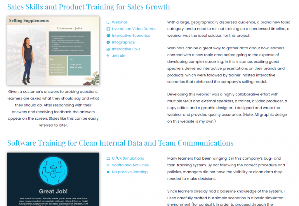
Digital learning specialist Diane Coradlo’s online project portfolio is a great example of discussing and demonstrating the execution of projects. In both quick-to-scan callouts and longer write ups she clearly points out the steps involved to build great elearning. Other instructional designers and elearning developers with portfolio sites that discuss the execution of projects include Montse Anderson, Matt Guyan, and Christy Tucker.
OK, to sum up, let’s review the list of reasons you need an online portfolio. An online portfolio is …
- A standard must-have for getting hired in our industry
- A way to demonstrate your professional skill set
- A showcase that communicates your can-do
- An opportunity to tell the story you most want to tell
- A project best completed with the luxury of time
Now that you understand its importance, let’s talk about the process of putting your online portfolio together.
6 Biggest Mistakes to Avoid with Your Portfolio
Good news! Building an instructional design or elearning portfolio is not that different from creating a learning program. You begin by understanding your audience and what they need to know, then build your content simply and clearly around that. Let’s take a look at that first step now.
Maybe we should answer the where-to-start question by talking about where not to start. Most people make a big mistake here, and it’s an error that can slow your momentum toward creating an online portfolio: Don’t start with the work you’ve already done.
Wait, what? Isn’t a portfolio a showcase of past work? A visual snapshot of past projects?
Actually not. As we stated earlier, your instructional design or elearning development portfolio is a showcase of your skills and your ability to solve the problems a hiring manager or client is facing. We’d like to point out that the “past project snapshot” approach doesn’t do either of these very well. Here are two primary reasons why that’s true (and four others to avoid as well):
1: The Off-target Content Problem
First is the off-target content problem.
When you take a look at any past project as a possibility to include in your portfolio, you will probably realize that it falls short as a snappy showcase of your skills. Why? Because when you first worked on that project, your objectives were different. You weren’t going for “snappy” or “showcase,” you were building a training program to meet a specific audience’s needs and to satisfy a set of stakeholders. Even if you love the results of your efforts, you were working under real-world constraints that likely won’t translate well as a portfolio project.
2: The Not-Yours-to-Share (Proprietary) Problem
The next problem is the not-yours-to-share problem.
Most instructional design and elearning projects we work on will be proprietary and non-public. We may even be working under a non-disclosure agreement that prohibits our sharing any aspect of a project. That means that even if you put your blood, sweat, and tears into such a project, it’s not showcase material and cannot be put out into the world in a portfolio.
As a result of just these two problems, 99% of people, when assessing past projects for use in their portfolio, will soon be saying to themselves, “None of my past projects are going to work.”
While the off-target content and not-yours-to-share problems are bad enough, there are some additional reasons why the past project snapshot approach is a non-starter. These include the following:
3: The Slow Unfolding Problem
Real elearning projects typically go in-depth, taking a while to deliver their main points. The result is a project that unfolds too slowly for a portfolio. Show projects designed to be samples.
4: The Yawn Problem
You may have inspired your learners to do it, but a busy person without a compelling reason to view your 20-minute course just won’t do it. A sample should be a snippets of 1 minute or less.
5: The Not-My-Problem Problem
Showcasing your past work shows how you solved problems, yes, but it’s likely that the problems of the hiring manager are different. Illustrate how you can solve their problems!
6: The Looking Backward Problem
A snapshot of past work highlights work you did in past roles, but these may not be the direction you’re wanting to go now. Show hiring managers what you want to do, not what you have done.
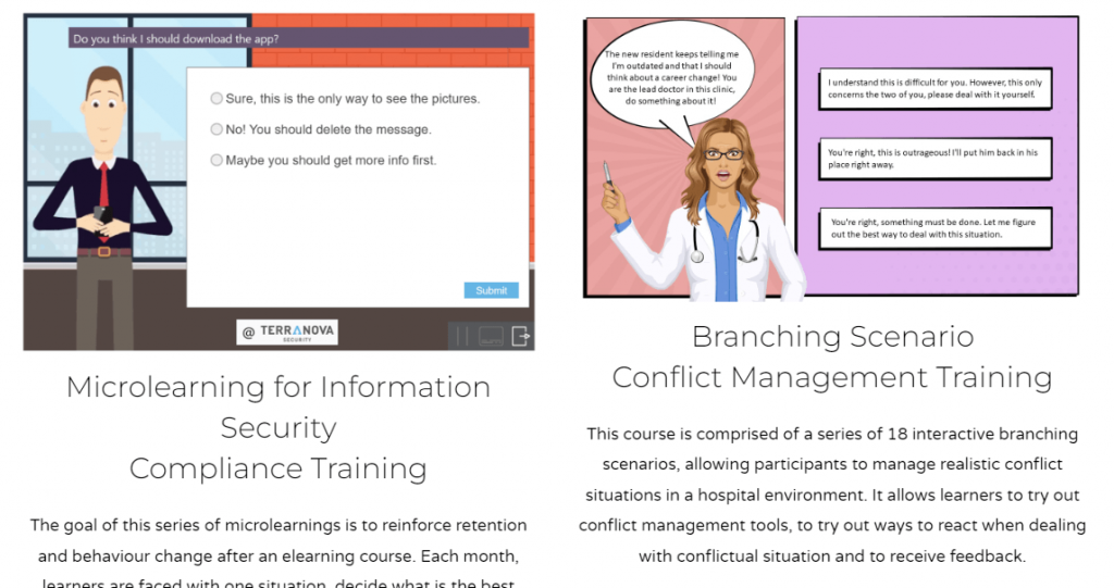
Instructional strategist Sophie Lanoix’s online portfolio includes sample projects she built specially for her portfolio site. Other instructional designers and elearning developers employing this smart strategy include Joanna Cappuccilli, Sara Greig, and David Leisey.
Where do you get started to create an instructional design or elearning development portfolio?
Start with the job postings of roles you're interested in
OK! You convinced me! So, where should I start?
Alright, we’ll get off our soapbox about where you shouldn’t start with your elearning portfolio and talk instead about where you should start. Here you go:
Start with what potential employers are already telling you they want to see.
And where will you find this information? In their job postings.
That means … before you do any portfolio planning, spend some time “job shopping.” Search in the places you’d go job hunting, and type in the terms you’d use to find your kind of job. Read through the jobs that pop up, and save a handful that sound like your kind of role.
Most every job listing will have three parts: Some narrative about the role and what you would be doing, a statement of minimum (must-have) requirements, and a list of preferred (nice-to-have) requirements.
The narrative section often defines the kinds of projects you’d be expected to work on and signals the kind of management and people skills you must bring to the role. The minimum/must-have and preferred/nice-to-have qualifications sections tend to offer more concrete guide as to what specific skills are being looked for in a candidate.
With that in mind, review the job listings you gathered. What do you see? What’s listed in each of the sections, and where do you see patterns across the listings? Take notes and get to know these listings, and feel free to gather additional listings to add to your knowledge base.
You’re going to plan a portfolio that addresses exactly what you learn from this research.
3 Questions Every Instructional Design Portfolio Must Answer
Half the battle of any project combining both words and graphics is to be able to visualize how the pieces will go together. In this section, we’ll show you a typical and effective approach for structuring an instructional design or elearning development portfolio. Think this through and you’ll have a quick and easy map to get your portfolio done. Let’s start with the question
What are hiring managers looking for?
Your portfolio should be planned and executed to answer the questions a hiring manager will typically be asking as they view your work. There are three questions that are most important to address. They are:
- Do your designs have appeal and show quality of workmanship?
- Do your examples feel relevant to them and their workplace?
- Do your projects show that you’re ready to solve their problems?
Let’s take a look at each of these questions in greater detail now.
The three questions your portfolio needs to answer
1. Do your designs have appeal and show quality of workmanship?
Like it or not, your portfolio will be judged by its visual design and attention to detail. If fact, first impressions do count, and an initial yes-no judgment of your viability as a candidate will happen in the first few seconds after the hiring manager lands there.
It may not even be conscious, but judge they will! That means:
- Your portfolio website design should be clean, modern, and well organized.
- Your visuals should be solid (and that’s true even if your role on projects is strictly instructional design and not heavy on building/graphics).
- You need to ask other people to review your site with a keen eye. No typos, no boo-boos, no “oops! didn’t notice that” should be allowed to be part of your presentation.
2. Do your examples feel relevant to them and their workplace?
If you’re applying for a job at a technology company looking for software training solutions and you show two samples focused on K-12 classroom management, the hiring manager will quickly conclude that your experience isn’t relevant. You’re showcasing work that’s from a different industry, on different topic, and for a different audience.
The hiring manager could easily conclude that you’d rather be working in an academic setting or that you don’t know how to train software. And, they could conclude that even if it were not at all true!
Avoid making the wrong impression about your skills, background, and interests, by being super-thoughtful about the examples you choose to showcase in your portfolio.
3. Do your projects show that you’re ready to solve their problems?
Right now, the hiring manager cares most about hiring a person who can efficiently and effectively solve the problems they face. This is one reason why a no-mistakes presentation is critical, for example. If a person is delivering errors in their own promotional materials, would they catch errors in work projects?
On a broader level, the goal for your portfolio projects is to convey an unalloyed “Yes!” about your ability to identify, address, and solve the kinds of problems faced by the person hiring you.
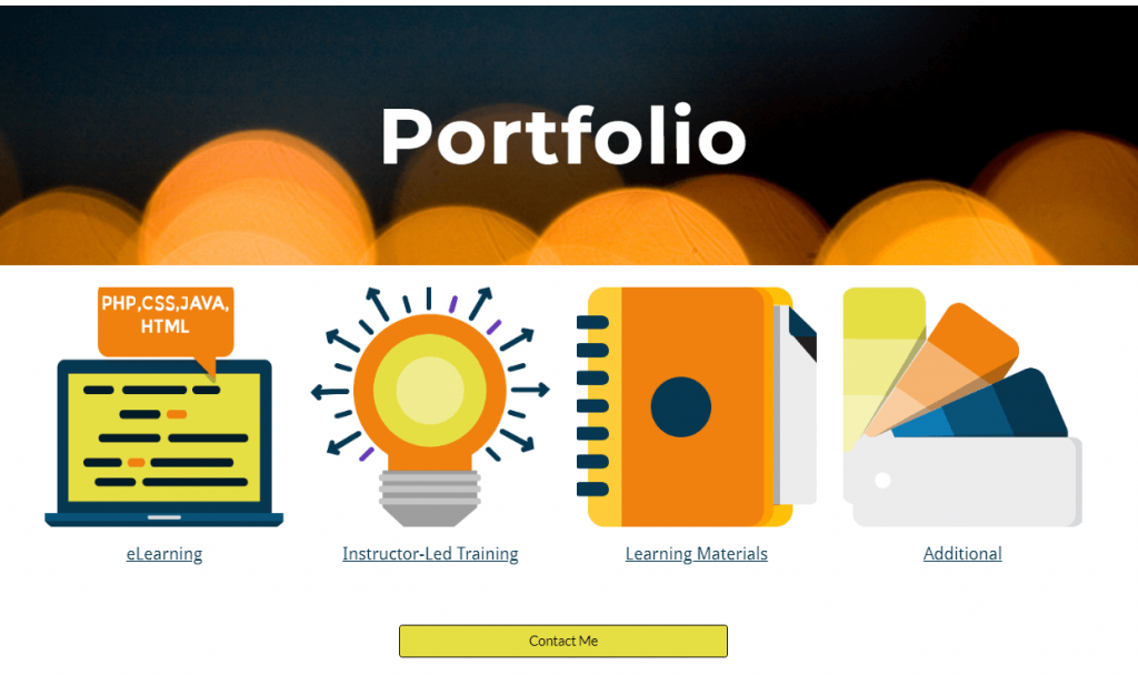
Instructional designer Star Peterson’s online portfolio is a good example of taking the three key questions into consideration. The projects found there look good, target business managers, and clearly define how Star solves the viewer’s problems. Other instructional designers and elearning developers that do a great job at this include: Diane Coradlo, Jenny Glenn, and Richard Watson.
The 5 Critical Parts that Must be Included In Every Instructional Design Portfolio
Now that we’ve outlined what the hiring manager is looking for, let’s talk about how you can deliver on those expectations. For starters, keep in mind that your portfolio site itself is communicating about your skills in creating a user experience. You’ll want to make sure that it is well structured and visually appealing – the same goals you’d have for an elearning program.
At its simplest, five sections are needed for a portfolio website that’s built for an audience of hiring managers. The five parts that must be included are:
- Home – The spot where your visitors will land when they navigate to your site. This is where first impressions happen.
- Project Showcase – A section attractively highlighting your portfolio projects, designed to encourage clicking to view the samples.
- Portfolio Project Write Ups– A page for each portfolio project, with a viewable sample (if applicable) and supporting graphics and copy.
- About – Information about you, with brief background information and an emphasis on what you offer the viewer.
- Contact – A section that clearly shows how a viewer could get in touch with you.
These sections may be on separate pages or they may all live on a single page. (Note, though, your site will probably not be what’s referred to in web design as a “one-pager.” That’s because each of your portfolio project writeups will likely require a standalone page for the best presentation of their merits.)
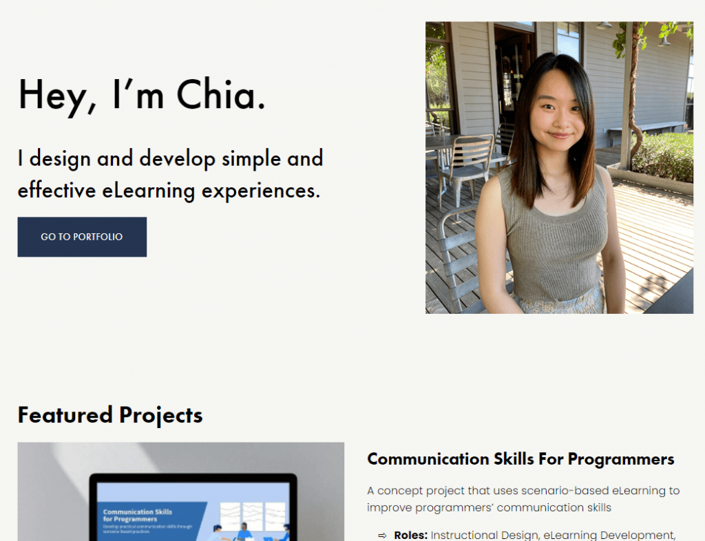
Instructional designer Chia Yeh’s portfolio site is an example of a simple page structure, with most elements on the home page and jump outs to specific project write ups and an extended About page. Other instructional designers and elearning developers that have used this approach include Alex Hoffman, Frederic Brewer, and France Hernandez, whose portfolio site is featured in the next section.
A Good Portfolio Template Example for Instructional Design and eLearning
Next, let’s take a look at each of these five sections.
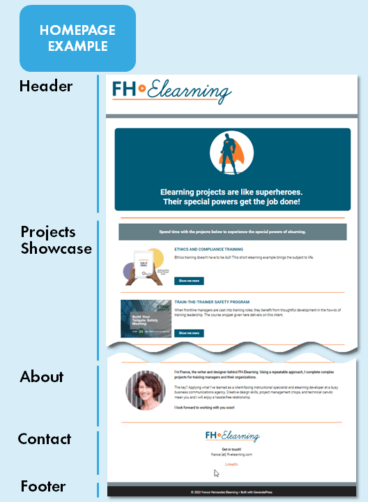
1. Home
The homepage of your online portfolio serves as the front door to the website. Here, you can make the most of the opportunity to control the viewer experience from the first moment they land on your site. Ideally, it will serve as your online billboard for what’s special about you and your skills.
To keep things as simple as possible, choose to put the Projects Showcase, About, and Contact sections all on your home page. This means a viewer can capture the most important information you have on offer by simply scrolling down the first page they land on.
This approach also reduces the total amount of copy to be written and graphics to be sourced for your site, so you’ll have more time to produce attractive project samples.
Remember to always ensure that your viewer can move around on your site. They should be able to effortlessly jump to the information that’s most important to them, without encountering deadends, losing their place, or missing key information. If they get frustrated, they will leave, so this is an important part of designing your site.
2. Project Showcase
As the name suggests, this section puts your sample projects on display, and should always do so in a way that makes your viewer want to see more. So, for the Projects Showcase section, put on your marketing cap, and answer the question, “What would make a viewer want to click on these projects to learn more about my work samples?”
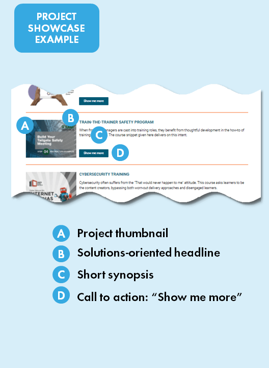
The Project Showcase section not only provides an at-a-glance catalog of the portfolio pieces on your site, it also helps to sell you as a person who can clearly present information in an attractive way. Here, the focus should be on a consistent method of presenting the following for each of the projects:
- A visually-appealing project thumbnail
- A solutions-oriented headline
- A snappy 10 – 15 word synopsis
- A clear call to action (CTA) to view more
A click on the CTA associated with any of your showcased projects will open a new page that is dedicated to that project. You will need a project subpage for each project, but don’t worry because these pages can all be built on the same basic template. Let’s take a look at that now.
3. Portfolio Project Write Ups
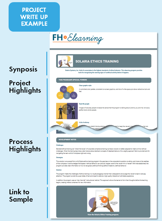
This section of your portfolio website is actually a collection of subpages, with one page for each featured project. Typically, these pages include a live version of the project, supporting headlines and written copy, plus screenshots or other illustrative graphics. We refer to this collection of resources as a “project write up” and think of it like a catalog page – one page per project.
One mistake you’ll want to avoid is to simply post a published file, but provide no bracketing content. Unfortunately, with this approach, if the hiring manager viewing your site chooses not to watch your sample, they’re not going to learn anything about your skills. The bracketing content on your project writeup page can provide an at-a-glance opportunity to tell your story of smart problem-solving and strong project execution – don’t miss out on this!
In your writeup, be sure to focus on the following:
- How your project is a solution to a defined problem (“Most elearning is a snooze fest”)
- How other people might (incorrectly) approach this problem (“Adding ho-hum in-tool interactions doesn’t help”)
- Your solution and how it’s better (“Make elearning better with rich story-based scenarios”)
- At least three (but no more than five) project highlights (“Use true-to-life situations” … “Choose real looking characters” … “Engage the learner in the story”)
Keep your writing succinct with short, action-oriented sentences. Employ headlines that are easily scanned, so if that’s all the viewer reads, they’ll still get the message about the problem you’re solving and how you did that.
In sum, each portfolio project writeup provides an opportunity to position yourself as a solutions provider, to demonstrate your process, and to rise to the top compared to other candidates.
4. About
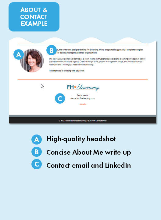
In your About section, you briefly introduce yourself to the viewer. The goal is to convey that you’re a real human who’s great to work with and gets the job done.
This section is the spot to include an attractive headshot, a short professional bio, and a statement about your skills and motivations. Here are some tips for each of these items:
Get a pro (or near pro) headshot with good lighting. During the photoshoot, relax and let the camera capture the friendly person you are.
Write a little something about your professional background and goals. Employ an upbeat, confident voice.
State compelling reasons why the hiring manager should want to work with you. Align these to your skills, and don’t be shy about it.
5. Contact
This final must-have section for your portfolio website tells your viewer where and how they can get in touch with you. This can be as simple as listing your email address and adding icons that link out to your LinkedIn or other professional social media profiles.
How do you build an instructional design or eLearning portfolio?
Now that you understand what you’ll be including on your portfolio website, you’re ready to take action.
Important Note for Portfolio Site Builders: Before you do anything, take a moment to agree with yourself that you will not get bogged down on the technical aspects of building a website. Keep that part of the project simple, in fact, by considering a “visual builder” option like Wix and Squarespace. After signup there, choose a simple template that meets your needs and you’ll be able to easily take your site from idea to completion.
In general, we find it’s best to organize the portfolio building project carefully by visualizing the flow of the website. From there it’s not too difficult to create project samples, write copy, and produce graphics that deliver a unified viewer experience.
To build your portfolio, we suggest that you take out a calendar and block out time to complete each of the following steps.
8 steps in the portfolio building process
1. Understand what employers are looking for.
As we discussed above, you’ll be better off if you don’t attempt to build a portfolio with work you’ve completed in your previous job roles. Instead, start with what employers are looking for!
You can get that information from current job postings for roles and positions you’re interested in. Gather some listings and analyze what’s being asked for. If every listing requires “Articulate 360 or similar authoring tool” or lists “ability to assess learner needs” as a minimum qualification, make a note of it.
2. Visualize the hiring manager and analyze how you can help them.
You’ve probably had enough workplace experiences to be able to imagine the kind of person that will be viewing your portfolio site, right? Well, your portfolio site is about meeting them where they are and showing how you can help them out. Use your own workplace experiences and read between the lines of the job listings you’ve been looking at, to make a list of the kinds of problems your kind of hiring manager is likely to be facing. Then for each of those problems note what you have to offer that could help them out. With this information, you’re ready to talk about yourself as a solution provider, and that’s just what you want to be able to do on a portfolio site.
3. Plan a slate of 4 - 6 sample projects.
Based on your job listings analysis and your new solutions orientation, consider what samples will best convey that you have what the hiring manager is looking for. Think about things like:
Will you be applying within a particular industry? If so, plan samples that show that. (For example, if healthcare training is your speciality, your samples can focus on topics, audiences, and challenges relevant to that kind of workplace.) You may not be targeting a particular industry, so ask yourself what is consistently looked for across general business/tech, industrial, education roles and plan projects that show those things.
Are you a specialist or is a particular kind of project or authoring tool being called for? For example, maybe your specialty is software training and the documentation that goes with it. Plan projects that show off this skill set. Or, maybe you’re seeing a consistent call in the job listings for a particular tool. Meet the call by planning samples executed in the tool.
How can you show a diversity of design in your samples? Although design is super-important in presenting yourself, everyone has a different sense of what “good” design is. That means you’ll want to plan sample projects that convey your ability to meet a variety of design situations and styles. Examples of these might include program designs that are reliant on text and reading, designs that make use of photo or illustrated characters, and designs that use interactive graphics. Including a variety shows that your skills are adaptable to the hiring manager’s needs.
4. Create your first sample (and keep it simple).
You may have heard business startups talk about a “Minimum Viable Product” to test business ideas. When you create your portfolio projects, we suggest you use that same thinking and create “Minimum Viable Projects” to communicate the things you’ve determined will be most important to the hiring manager.
In practice, that means “Think short and sweet!” For example, a sample project with a 60 second runtime will be effective. There’s no need to create a 5-minute project or a 20-minute project! When you limit the runtime, you’re forced to tighten up your sample to deliver the planned impact and you save lots of building time, too. (Hint: If you’re working on script-based elearning, about 150 words of script will equal 1 minute of runtime. Control your word count to control your build time.)
Another aspect of creating a Minimum Viable Project is to keep it simple. Think about what you want your viewer (that is, the hiring manager) to take away from the program and trim away anything that’s not contributing to that.
For now, just get one project done. You’ll want to test it a bit on your site, establish a structure for project presentation, and see what else you can learn before you power out and get the remaining samples built.
5. Build your first draft portfolio website.
We hate to say it, but you’re now entering the project danger zone! Why? Because website building can be a deep time sink, and we’ve seen portfolios started with the best of intentions but never completed because of just that.
It’s easy, but completely unnecessary, to get caught in a number of traps related to creating a website that presents your own self, and the biggest of these is perfectionism. Push back on the notion of presenting the perfect version of yourself and your work! Instead, stay focused on showing how you’re going to be a great asset to the hiring manager’s world and showing that simply and warmly.
Besides, you need not go live with the website you build at this step. The important purposes this starter site will serve include the following:
Help you determine what (and what length) copy needs to be written for each section.
Clarify what’s going to work with respect to graphics, so you’ll know what you need to produce.
Allow you to test the upload and deployment of your completed sample program.
Give you a chance to look at site elements such as navigation and user interface.
Right now, don’t worry too much about anything too fancy. You’re just prototyping to work out any initial issues and give yourself some assignments for the next steps.
6. Complete the To Do list.
OK, it’s push time, people! During this step, you’ll complete the following items:
- Complete the necessary copywriting tasks, maintaining a consistent, upbeat voice, using simple language, and snappy sentences.
- Complete the remaining sample projects. (Remember: Minimum Viable Projects only!)
- Produce, acquire, or screenshot the graphics needed for your webpages.
- Choose an appropriate headshot for yourself.
- Finalize any technical details, such as purchasing a URL, signing up for web hosting, or learning how to upload and link your samples to your website.
As you complete these items, file them in an organized way. This will make finalizing your site much easier and faster.
This would be a good spot for a content upgrade … “We’ve gathered up the steps in portfolio building, print your To Do list here ”
7. Finalize your website, proofread, and call it complete.
You are so close to having this project D-O-N-E! When you have everything stacked up neatly against a clear plan of deployment, building a really great website can be a quick, couple-hours-only job. Go to it!
Once you’ve got things to the point where you have a live website that you can link someone to, find a friend, family member, or someone who owes you a favor and ask them to go over every page and view every project with an editor’s eye. You need this picky proofreader to look out for typos, confusing syntax, unexpected interactions, and things that seem like they should work but don’t. Then, set a time with yourself to fix anything they find.
8. Give yourself a big “Congratulations!”
You’ve completed a project that many people think about but don’t actually do. That makes you part of an elite group that can step into the elearning and instructional design job market and respond to the best opportunities both quickly and confidently.
Good job!! We wish you the best of luck in all your pursuits!
Instructional Design and eLearning Portfolio Project Ideas
To decide on the topics for your instructional design or elearning development online portfolio samples, start by understanding the kinds of problems your would-be employers are trying to solve. For example, let’s say you’re loving (and feeling like a perfect fit for) a job listing that states this:
“The person in this role is responsible for the design and creation of learning materials to be used to support ABC Co’s global customer care teams, deployed internally and to our third-party vendor partners.”
Taking a close look at that, there are several project possibilities suggested in just that one sentence! These include “support … customer care teams,” “global … teams,” “deployed internally,” and “deployed … to our third-party vendor partners.”
From here, it’s possible to take an educated guess about what kind of project might show your skills in that area, and once that’s defined topics will likely fall out of that. Here’s what we came up with:

If you have a sense of what you think the employer wants, but aren’t sure about topics in that area, good ol’ Google is always happy to help! Do a search on something like “training issues for global call centers,” “global call center challenges,” or “managing global call center teams.” Look for a blog or similar search result and skim what’s posted there. You’ll likely pick up several viable topics that way.
At this point, you’re probably just brainstorming to settle on a few topics that seem like they will display your skills, signal your interests, and, yes, be kind of fun and easy enough to build.
Ultimate list of instructional design and elearning portfolio examples
Alphabetical list by last name
Want your portfolio added to the list, contact us here.

