

How do you deliver a better presentation?…
How do you simplify complex data?…
How do you avoid feeling nervous before a presentation?…
Presentation expert Jon Schwabish answers these questions and more in my interview with him below.
Jon is the author of the 5-star rated book Better Presentations: A Guide for Scholars, Researchers, and Wonks and a master of data visualization and presentation design.
If you like this interview, you’ll love the book.
What’s one practical tip to deliver a better presentation?
Don’t be worried about the raw number of slides you have in your deck. The number of slides is not correlated with the length of time you speak. Use as many slides as you need to effectively communicate your ideas and content.
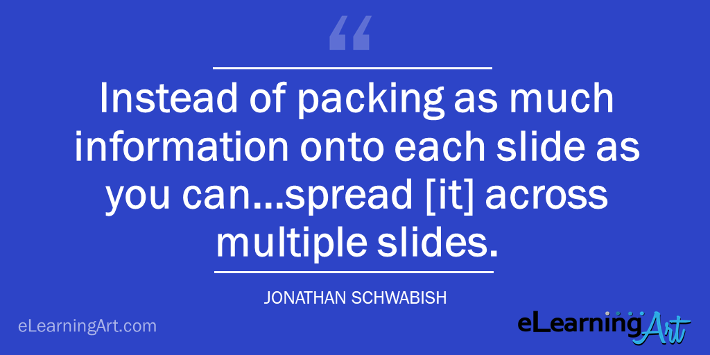
That means instead of packing as much information onto each slide as you can–in an effort to keep the number of slides down–you can spread that information across multiple slides. Make it as easy as you can for your audience to grasp your content by using pictures, images, and larger text.
What’s the biggest mistake people make with presentations, and how can they avoid it?
The biggest mistake presenters make is thinking that their presentation is for them, not for the audience.
As an example, take the standard text slide we all see all the time, packed with text, bullets, and sub-bullets. That is all there so the presenter doesn’t forget to mention all 6 points. But that neglects how the audience is receiving the information.
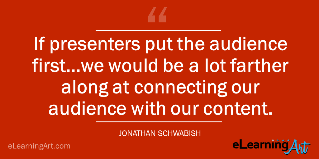
If presenters put the audience first (with or without slides) we would be a lot farther along at connecting our audience with our content.
What’s your favorite presentation and what made it great?
I saw Scott McCloud, who wrote Understanding Comics: The Invisible Art, give the capstone presentation at the first Tapestry Storytelling conference in 2012. His presentation covered the art, design, and method of communicating through comics.
His slides combined different graph/comic types and moved in different directions to match the content. For example, he showed one comic where the cells moved vertically and horizontally. He didn’t just put the entire thing on one slide, but blew them up and moved them in each direction.
He did a shorter version in his TED talk, but seeing the hour version live was amazing.

How do you plan out your presentations?
I start by outlining the talk. We are all taught to do this in grade school when we write our first book report, but for some reason we tend not to plan our presentations in the same way. So, I outline the talk and think about the specific questions I want to answer, messages I want to convey, and then build the sections of the talk and craft my opening and closing statements. I constructed a worksheet (and other resources you can download) to help guide me through this process.
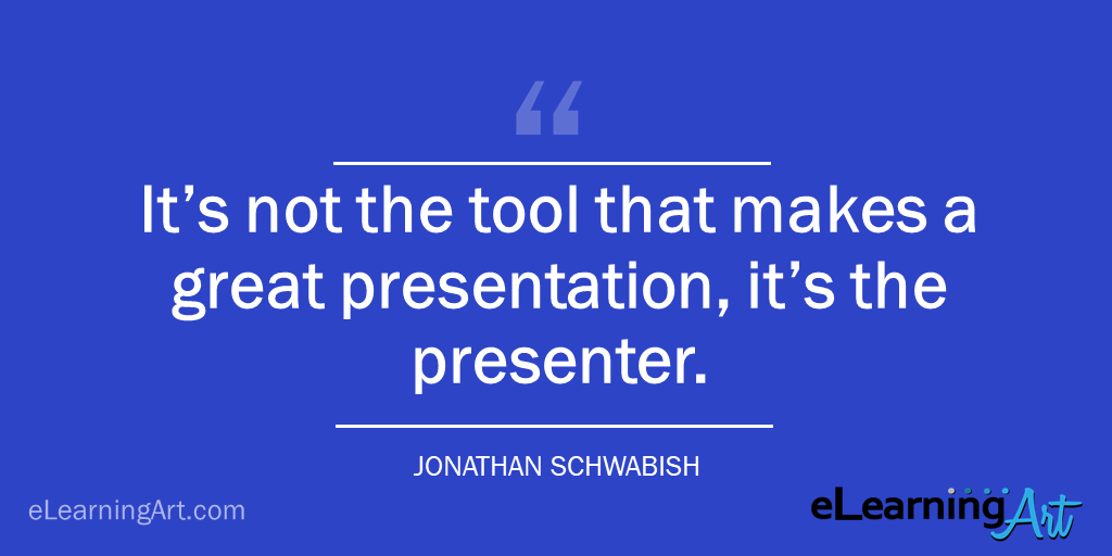
Once I have the outline done–usually a combination of handwritten notes and a text document on my computer–I’ll move to drawing out each slide on a 3×5 index card. I use lots of markers and colored pencils to help organize them into sections. In this way, I feel like I can move things around so they fit just right. I then move to the computer–I typically use PowerPoint, but also Keynote and Slides. It’s not the tool that makes a great presentation, it’s the presenter.
This tends to be a long, involved process and I don’t do it for every talk. If I have a short talk or something that’s a little less formal, I may just use the worksheet and then go right into the slide software program.
What technique can people use to simplify dense text or complex diagrams?
My preferred technique, and the one I talk about in detail in my book, is something I call Layering. Others have called it a “reveal” or a “build”, but it’s basically taking the dense content and splitting it across multiple slides so that you present the information step-by-step. In this way, you can bring your audience along with you, revealing each bullet point, graph, or image slowly.
You can think of Layering by taking your text slide with 6 bullet points and simply breaking it up into 6, separate slides. You can also apply it to graphs–instead of showing the line chart with 4 lines at one time, break it up to 4 slides, building up to the final chart.
How can we display data better in a presentation?
Don’t feel obligated to show all of your data all the time.
Oftentimes, you can boil down your findings into the handful of numbers that help get you to the core of your idea.
As an example, instead of showing the time trends for 5 states over a long period of time, maybe it’s just the endpoints that are the most important. In that case, you can use a different chart type, like a slope chart.
Which leads to the other thing I would encourage presenters to do–learn about data visualization best practices and different chart types. Not because new or different chart types are inherently better, but because sometimes seeing the data in different ways, can help us see patterns and glean insights in new ways.
What’s your best PowerPoint tip, trick, or hack?
I don’t have a ton of keyboard shortcuts in PowerPoint, but I do customize my toolbar. When I do that (right-click on the toolbar at the very top of the window), I can add any button I want, especially the alignment buttons, which makes life a lot easier when you’re working with different slide objects such as text, images, and graphs.
In Excel, my favorite keyboard shortcut is CTRL+1 (CMD+1 on Macs), which will bring you to the Format menu. And it works for everything–cells, line charts, bar charts, axis labels, gridlines, whatever you need.
PowerPoint defaults to black, bulleted, 18 pt Calibri font, on a white background. Thoughts?
Looks like everyone else’s slides, doesn’t it?
Why use the defaults when it’s easy to create your own look that will stand out and help you effectively deliver your content to your audience.
At the very least, use a dark background–Guy Kawasaki is quoted as saying, “Dark says seriousness. Dark says gravitas.”
Then, use a different font. There are lots of good default fonts on your computer, so don’t be afraid to hit the drop-down menu and pick something else. And make that font bigger! I don’t have a specific font size I recommend, but I’ve seen authors suggest a minimum of 28 pt. If that size looks good to you, then set that as your minimum. Not only will the person in the back of the room be able to see the text, but you won’t be able to cram all 6 bullet points on a single slide because they just won’t fit.
What are some strategies for dealing with nerves?
Look, everyone gets nervous before they present. Nervousness suggests you care about how your presentation goes over, so it’s not necessarily a bad thing. It’s when being too nervous stops you from doing a good job that you need to take action. There are a few things I try to do when I’m nervous:
- Envision yourself doing a great job. There is research that suggests if you can imagine yourself doing a good job, you’re more likely to do so and be less nervous.
- Try Power Poses; for example, holding your arms above your head in a championship form. There is some research that throws some doubt on the effectiveness of Power Poses, but they work for me.
- Get there early and talk to the audience. Unless you’re Steve Jobs launching the latest product or the President of the United States giving the State of the Union, it’s okay to talk to people in your audience. Get to know them, their challenges, and what they hope to get out of your presentation. Doing so can help you cater your message to their specific needs and it also gives you some friendly faces to look for when you speak.
- Exercise or meditate. Get the blood moving. When done regularly, exercise and meditation can help relax your nerves and center your attention to the task at hand.
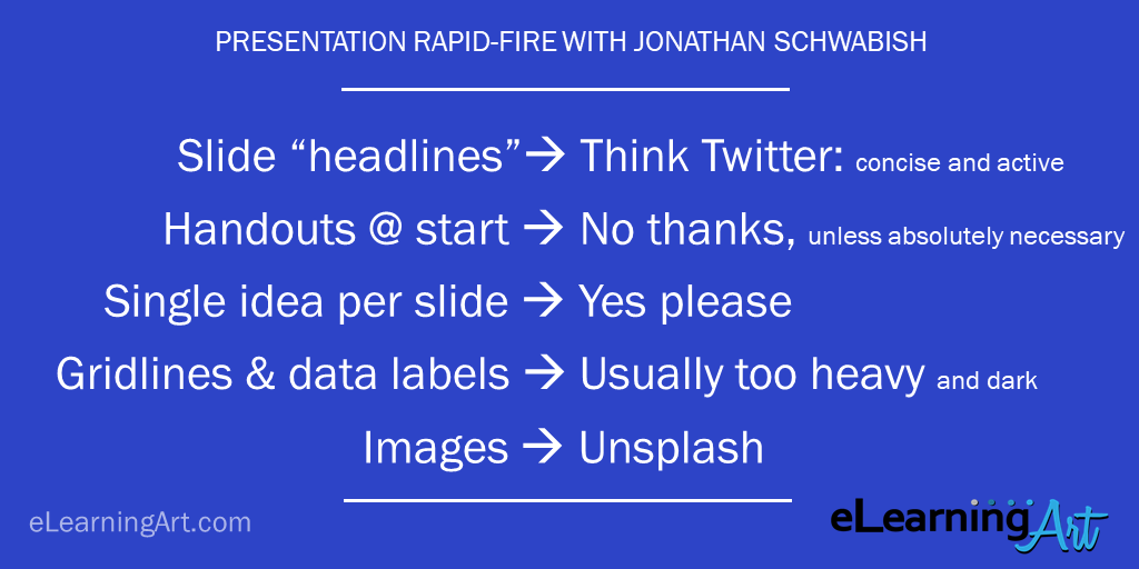
Rapid-fire word association. First word or phrase that comes to your mind as it relates to presentations:
- Slide “headlines”: Think Twitter: concise and active
- Handouts at the start of presentation: No thanks, unless absolutely necessary
- Single idea per slide: Yes please
- Gridlines, ticks, and data labels: Usually too heavy and dark.
- Presentation images: Unsplash.