 Last week I shared my #1 best recommendation for controlling the design conversation:
Be proactive, not reactive, in design conversations with stakeholders.
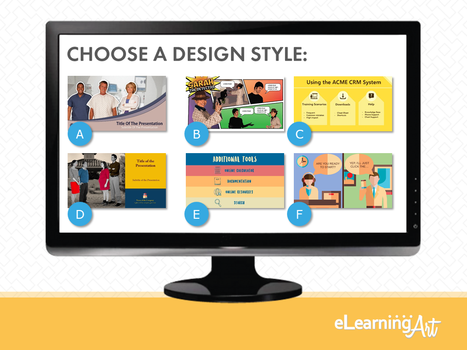
You learned how I offer a choice of design treatments to project stakeholders. And, you learned my secret, too.
I only show reliable, proven styles that me and my team can get done with confidence.
Something like this:
The insider info every workplace learning designer should know is that some of the best designs can be done in that good old software tool we all have right on our computer: PowerPoint. And that means no need for fancy graphics applications or the experts trained in them!
In fact, knowing the “recipes” for even just a few attractive design styles provides such a leg-up in controlling the design convo, that I want all eLearningArt members to have the insider track too!
Well, good news! The first six design treatments are up and ready for you in the member library! Many more are in the production pipeline.
Even if you’re not an eLearningArt member (you should be!), I want you to experience the goodness that is eLearningArt Design Treatments.
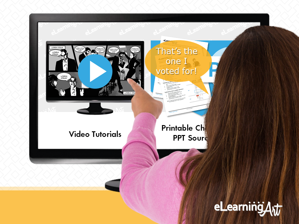
So I promised to put one “people’s choice” design treatment right here on the blog for the enjoyment of everyone.
Our independent accounting firm (um, that would be me) has carefully tallied your votes from the LinkedIn post … and the envelope please …
Good news! One of my favorite styles won! (In fact, I’ve even used it in the blog before!)
Without further ado, I’m pleased to release:
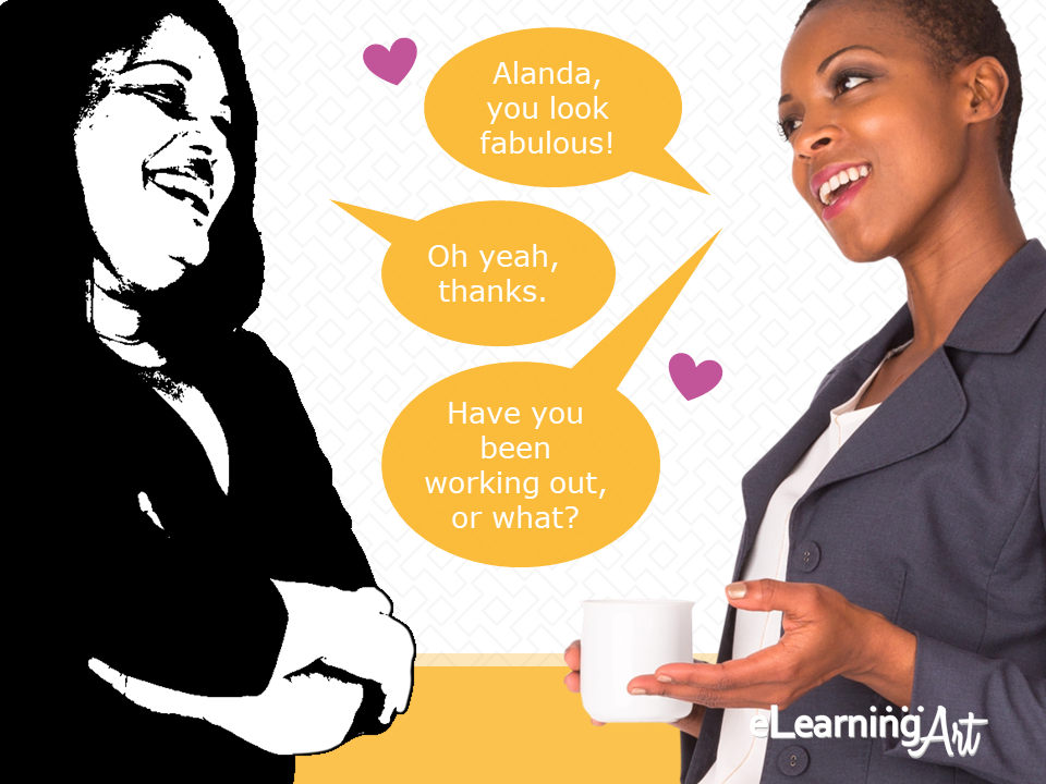
The Graphic Novel Style Design Treatment!
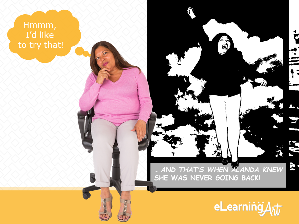
You might look at this and think that you have neither the toolbox nor the chops to create.
That was pretty much my reaction, too, when my designer first showed her Photoshop version to me. Determined to recreate the look she’d shown me, I locked myself in my secret lab and like a mad scientist, reverse-engineered the whole process in PowerPoint.
The result was too good and too easy not to share with the world!
Luckily, I documented the whole process, and that’s what I’m delivering to you as an:
Ultra-Easy But — Wow — Looks Kinda Tricky Design Treatment Decoding Package
Shall we agree to call these Design Treatments for short?
Here’s what’s included:
#1: Video tutorial on character treatment
#2: Video tutorial on background styling
#3: Step-by-step cheat sheet PDFs
#4: PowerPoint source file
And, as a #5 Super-hack cheat step, I’m also going to teach you a simple trick to create the same style on multiple objects … in just two clicks!
That means you can go from “before” to “after” in seconds!
With all that said, jump here and get started on your own design transformation!!
Nice work! With this style under your belt, you have a design you can feel comfortable showing your stakeholders, easy-peasy.
Now, hop into the library and learn a few more, and you’ll be on your way to rocking elearning — and all workplace learning — design!

