 It’s a great feeling when all the needs-assessing, info-gathering, SME-wrangling, script-writing and other just-getting-ready details of a workplace learning program finally fall into place.
It’s time to move over to program development, at last!
So why does the elearning development step often feel so exasperating??
I think it’s because most of us are stuck working without a framework for our building. Which means (if you’re anything like me) we kind of make it up as you go along.
Problem is, that equates to many decisions ahead. Every slide is a little project of its own, and that just bogs us down.
Recently, I realized something I wish I’d realized sooner:
Anything that simplifies slide-level decision making speeds up the program development process.
Simplified decision making makes the nitty-gritty of workplace learning development easier and — my personal gold standard — more fun.
In this article, I want to talk about one super-important concept that has made a big difference for me. It can be summed up simply, like this:
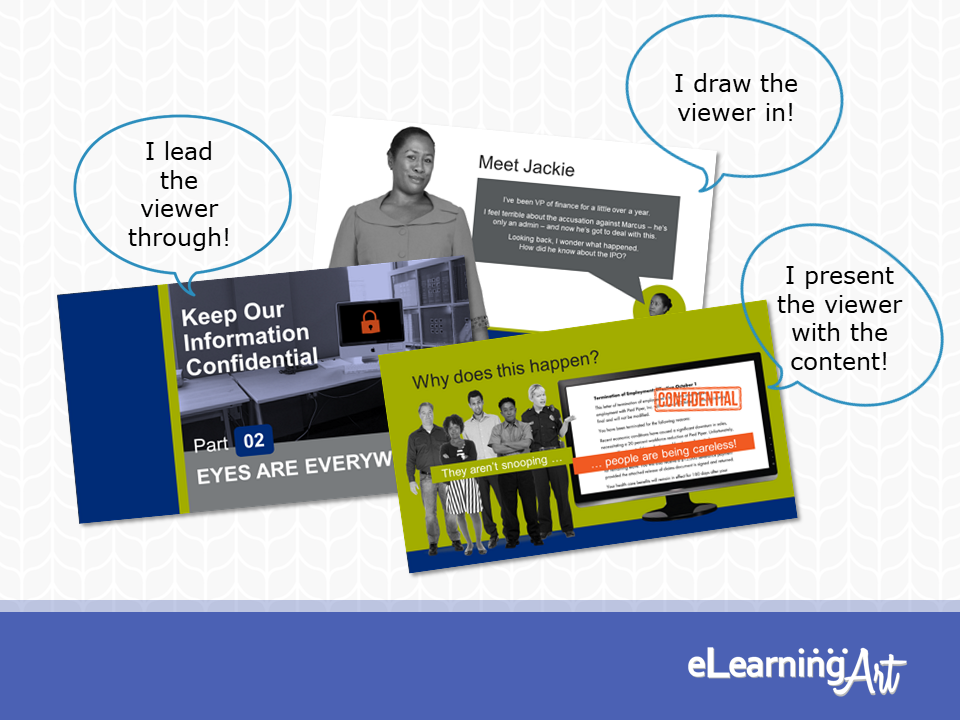
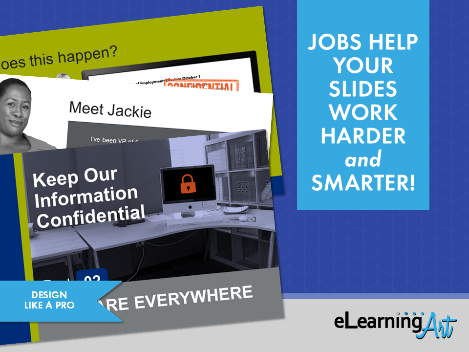
Every Slide Has a Job
Just like your workplace learning project has a purpose — to move people toward can-do, to transfer knowledge about something they need to know, or to change their minds on a subject — each of the slides in your project has a purpose, too.
Each slide in your program will do one of these things:
- Lead the viewer through the program
- Draw the viewer into the content
- Present the viewer with the program content
The key word here is “one.”
A single slide should have a single job.
If a slide must do more than one of these jobs, design approaches begin to overlap, and slide development becomes tricky.
In fact, this is so important that you can use the rule to troubleshoot slides that just aren’t working. Is the slide trying to do more than one job? Both you and your learners will be working too hard.
Do yourself a favor.
Let each slide perform a single job and avoid creating design challenges during slide development.
You are likely to find that doing so speeds up your production process even if it adds a few slides to your project.
Let’s zoom in on these slide jobs now.
Guidepost Slides: Leading your viewer through the program
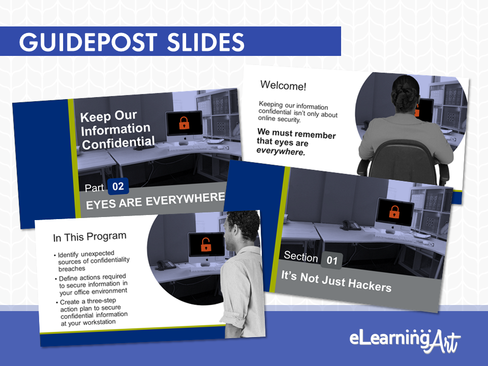
There’s a batch of slides present in every workplace learning and elearning program that exist only to move the viewer across the program itself. Let’s call these guidepost slides.
These slides don’t deliver program content, but they do help to:
- Establish the look and feel of the program.
- Inform your viewer about where they are in the program.
- Provide cadence to the program.
Typical slides serving in the guidepost role include the welcome, learning objectives, navigation slides, and copyright slides at the beginning of the program, the section break slides throughout the program, and resource, thank you, and how-to exit slides at the end.
All guidepost slides convey something about the program and where the viewer is in the program, but they do not dish up much in the way of learning content.
How Many Guidepost Slides?
It pays to be thoughtful about the use of guidepost slides. There is a “Goldilocks number” for how many should be present in your program, but there isn’t a specific formula.
The “just right” quantity of guidepost slides depends on your material, the length of the program, the instructional framework you employ, your organization’s traditions, and other factors.
You do want to look for that just right number, though!
Too few transaction slides can lead your viewer to wonder where they are in the program.
Putting that another way: If your viewer is wondering how close they are to d-o-n-e, they’re probably not thinking about what’s being presented.
On the other hand, too many guidepost slides slows the pace of a program. This will cause the viewer to think thoughts along the lines of “what a waste of time!” Ugh.
The Key: Question Conventions
While it can sometimes seem that there are hard and fast “rules” dictating the points at which a section title, a learning objectives slide, or a navigation how-to should appear, these are only conventions.
In fact, many of the conventions reflect approaches to information presentation that worked well in printed documents, such as textbooks, reports, journals, and so forth. But ask yourself, do you think of those types of documents as being exciting? (Didn’t think so.)
Take a chance, go for it, and try something new! As a result, your workflow may be simpler and your program more interesting and engaging.
So, how can you break away from the usual?
- Start by considering your material. Could you jump directly into a scenario or some other active experience (I’m talking slide #1 here)? Maybe you could start a story, leave it on a cliffhanger, and then drop in your main title slide. This would be a gripping opening, for sure.
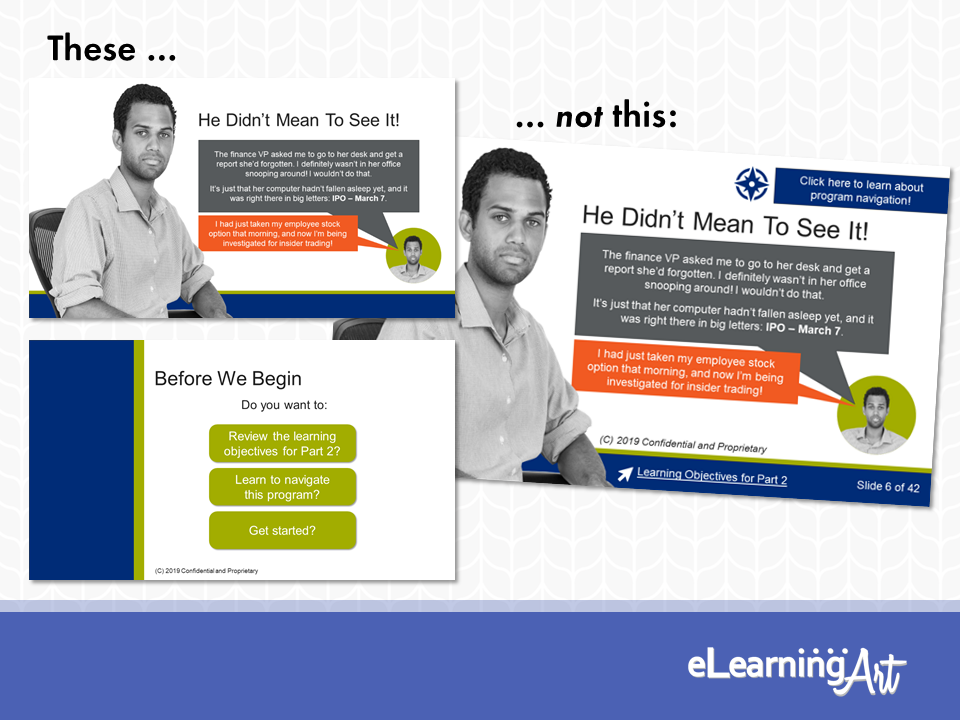
- How about delivering some of the guidepost slide material on an opt-in basis? Some viewers may prefer to jump into the program without finding out about learning objectives or reviewing navigation how-to. Let these people advance, but give those who are interested an option to learn more with a button branching to the info. Win-win and everyone’s happy.
Transition Slides: Drawing your viewer in
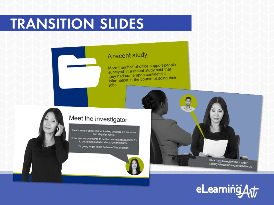
The next type of slide present in a workplace learning program is the slide that supports, but doesn’t necessarily deliver, program content. These are transition slides.
A transition slide brings the viewer “into the room” and helps to get him or her ready for the material that counts. This can take a couple of different forms.
Transition Slide – Role 1: Getting Everyone on the Same Page
Sometimes the focus of a transition slide will be to remind the viewer of foundational key terms and concepts related to the material about to be presented. You can often spot these slides by the phrasing used in the script. Here are some examples:
| When your script says: | It’s signalling: |
| “As you know, our corporate mission is…” | We’re reviewing stuff we expect you to know already. |
| “As you’ve seen in the previous module…” | We’re going to recall material presented earlier, please step back mentally to that presentation. |
| “Before we begin, let’s review the terms used in this program…” | We’re revisiting content-specific details likely to be familiar to you. You’ll need to know these to understand what we’re going to talk about. |
Honestly, transition slides aren’t the most interesting slides, and like their first cousins, the guidepost slides, should not be allowed to overrun your program.
If you determine that many of these slides are needed in order to ensure that the program’s content is understood by all viewers, consider the following options:
- Provide the context material via optional branches accessed by clicking an on-screen button or hyperlink.
- Develop a separate program as a “prequel” to support the current one.
- Create work aid-type references for download and printing.
This first role for transition slides ensures that the viewer is ready to take in the program content.
The second role of a transition slide is to situate the learner at the start of the story you’re using to present the content. Let’s look at that now.
Transition Slide – Role 2: Bringing the Viewer into the Story
In workplace learning, we want people to engage, and we want them to get the gist of the program.
Transition slides purposed with bringing the viewer into the story help make this happen. They can bring ‘em in and hook ‘em, too.
For example, in a scenario, you’re likely to bring some “actors” together on-screen to illustrate a conversation, a sequence of events, or a situation. Make sure that you bring the viewer into the scene, too. They need to know the basics of what’s happening in front of them.
To get that across, pick a mid-story starting place that answers the “What’s going on here?” question right up front, and spark some curiosity about what might happen next.
Several approaches, used separately or together, can help make this happen:
- Introduce the actors:
In her book “The Accidental Instructional Designer,” Cammy Bean refers to this as a “Meet Pete” approach. It sounds like this: “Meet Jackie, she’s the vice president of finance. She’s feeling pretty bad about the situation Marcus is in.”
- Signal the context in the scripting, and give the viewer a chance to explore the context:
VO: “The SEC investigator reviews the insider trading allegations against Marcus. Click on-screen to read over her shoulder.”
- Describe the context via on-screen text:
“Jackie meets with the SEC investigator to discuss Marcus and the allegation that he engaged in insider trading…”
- Show the context using on-screen graphics:
Background is a conference room
A display pad says “IPO timeline”
Jackie looks flummoxed as the investigator judges her story. (By the way, when you add in some emotional sparkle, you create a “what’s going to happen next” feeling in the viewer. Bingo! Job accomplished!)
Once the viewer understands the setting and start point of the story, they are ready to take in the content. Now you can complete that delivery!
Content Slides: Delivering program content
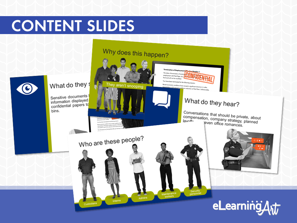
We’re here at last! Within the structure created by the guidepost and transition slides reside the slides most important to your workplace learning program. These are the content slides.
This type of slide is where the program gets down to business, presenting the learning you intend to transfer to your viewer.
Depending on the learning objectives for a given project, content slides can target a variety of objectives. It might:
- Illustrate and describe the steps and best practices related to a job process
- Package must-know information in an engaging and interesting way
- Provide an opportunity for interacting with new skills in a safe-to-fail environment
- Give immediate feedback about comprehension and retention of new material
It’s no coincidence that all of these possibilities show a bias toward action.
Success depends on more than just dropping some text and a picture on the screen and instructing the viewer to “Click Next to continue.”
Given their importance, these are the slides that deserve the most thoughtful attention from you, your subject matter experts, and others on your development team. These slides are your program’s whole reason for being!
These slides will also engage your graphic design know-how. After all, it’s right here where the two big “rivers” of content presentation — words and pictures — come together as one.
These slides call your best visual thinking into play and will reward you for being both a little daring and quite confident in your approach.
Wrapping Up
So that’s it! You’ve just learned the three primary categories of slides that appear in any workplace learning program:
- The guidepost slides that lead the viewer through the program
- The transition slides that bring your viewer into the material
- The content slides that deliver all the good learning
Use these to shortcut the planning, design, and development of your next workplace learning program. Keeping the “one slide, one job” rule in mind, asking yourself what kind of slide each bit of material needs, and paying attention to your learner’s trip through the program means easier development, and a better end result.

