I had the great pleasure of interviewing Connie Malamed, the “eLearning Coach.” Connie runs a fabulous eLearning website and newsletter, and is the author of Visual Design Solutions, the highly rated and reviewed book on visual design for eLearning professionals.
Connie was kind enough to share some really useful and practical tips on how to improve visual design, and more, below!
With that said, let’s get into the interview!
What are the most common eLearning visual design mistakes?
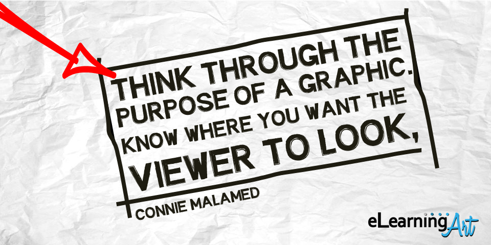
- Mistake #1: Lack of visual hierarchy. Solution: Think through the purpose of a graphic, so you know where you want the viewer to look. Then make the most important feature the focal point–the most prominent element of the graphic. Use size, positioning, vivid colors or visual cues to make it stand out.
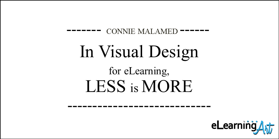
- Mistake #2: Clutter. Solution: In visual design for learning, less is more. Extraneous images and decorations are distracting. Therefore, remove the clutter and leave sufficient empty space (known as white space) in your designs.
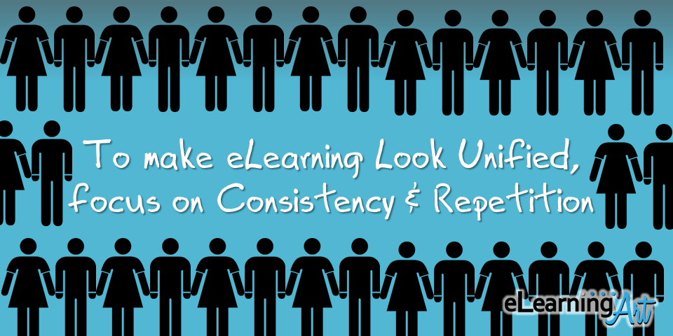
- Mistake #3: Lack of unity. Some eLearning courses look as though a different person designed every screen. Solution: To make eLearning look unified, focus on consistency and repetition, such as one color palette, reuse of shapes and consistency in image style. Don’t let it get boring though. Add enough variety to keep people interested.
What’s one tip to create better visual designs in our courses?
Readers can try Subtractive Design. In this approach, you remove every element up to the point where the design will break. Then stop.
For example, you might remove the logo that’s on every screen, the slide number, the extraneous image, a flourish that isn’t really needed, etc. Then re-evaluate the slide and see if it better communicates your message. Here is an article that describes the process in more detail: Subtractive Visual Design.
What’s your opinion on eLearning templates?
Well-designed templates are a good way to save time. They also promote a unified look. I usually make a unique set of templates for each project. Commercial templates can also be effective if the colors and the look and feel match the mood, content and audience.
How can eLearning developers improve as visual designers?
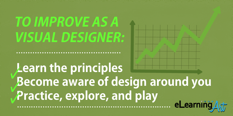
I think there are three aspects a person should work on to improve in visual design:
- Learn the principles. My book, Visual Design Solutions: Principles and Creative Inspiration for Learning Professionals, was written for this purpose. It teaches the principles of visual design in the context of designing learning experiences.
- Become more aware of design all around you. Study the design of packaging, signs, posters, magazines, advertisements, books and websites. Collect design books for inspiration. See what works and what doesn’t work. Modify the ideas you like so that you can use them in your own designs.
- Practice, explore and play. You won’t come up with the perfect visual solution on your first attempt. Try out different ideas and play around to discover the best solution.
Where do you find design inspiration for courses?
Design inspiration is all around us! Here are a few places to find design inspiration in your own environment:
- Magazine covers in supermarket displays
- Aesthetically pleasing websites
- Advertisements on subways and buses
- Animated movies and videos
- Posters around town and in stores
How does inspiration translate into a finished eLearning course?
In terms of visual design, you can use the aesthetic and/or the elements of the original inspiration and tweak it for your purposes.
I was recently at the bank and saw a poster with cool curvy shapes. I took that idea and created a template using similar curved shapes.
Here’s another example. If you’re not inspired by your color palette, then look at some of the designer portfolio sites at Behance and Dribbble and find a color palette that will work for your current project.
What’s in your “eLearning toolbox?”
I do a lot of different types of projects from learning experience design to website design. Here is my main tool set, but there are other apps and programs I use for lesser tasks.
- Brainstorming and Initial Design: paper, pencil, sketchbook
- Graphics: Photoshop, Illustrator
- Storyboards: PowerPoint or Storyline
- Prototypes: Storyline
- eLearning Development: Storyline
- Websites: WordPress, Dreamweaver
- Serious writing: Scrivener
- Hardware: iMac, Velocity PC, digital tablets for input
- Podcasting: Blue Yeti mic, Skype, Call Recorder
What’s your favorite type of eLearning to build?
I think more than having a favorite type of eLearning to build is the fact that I enjoy the creative challenge of designing a unique learning experience for each audience that fulfills their learning requirements. It could be in the form of a story, real-world scenarios, an interactive simulation or a game.
What do you say to the boss who doesn’t budget resources to design?
There is a business case for dedicating resources to better design. Here are three key reasons why.
- Effective design requires empathy for the learner, which means the design will be relevant and engaging. This maintains attention and enhances learning.
- Effective design will improve usability and reduce audience frustration.
- Effective visual design improves communication, increases motivation and adds credibility and professionalism to a learning experience.
What role do stories play in the eLearning courses?
Stories often play a big role in the courses I design because the human brain is attuned to learning through stories.
People are more likely to retain the knowledge embedded in stories than if it is presented as plain facts. For readers who are interested in stories, here is an interview I did with Lisa Cron, author of Wired for Stories.
In addition, scenarios are effective for making learning relevant and for simulating the situations that occur in the real world. If our goal is to improve performance, then scenarios are a way for learners to practice varied strategies and skills.
When I create scenarios, I often use your cut-out people for eLearning. I like the diversity in your stock photo characters.
What 5 books or blogs have influenced you the most?
Here are 5 books that have changed my perspective. There are so many more!
- Learning: The Art of Changing the Brain: Enriching the Practice of Teaching by Exploring the Biology of Learning by James Zull
- Writing: Bird by Bird: Some Instructions on Writing and Life by Anne Lamott
- Storytelling: Wired for Story by Lisa Cron
- General Design: Universal Principles of Design by William Lidwell and Kritina Holden
- Visual Cognition: Visual Thinking for Design by Colin Ware
Why did you write your book, Visual Design Solutions: Principles and Creative Inspiration for Learning Professionals?
I wanted to create a visual design resource geared to the special challenges that learning professionals deal with every day. Most instructional designers, trainers and educators do not have training in visual design. This makes it difficult to create aesthetically pleasing and usable materials. My book covers the visual design principles that a learning professional needs to become more competent when designing eLearning and slides.
I also wanted to help people in our industry to learn how to design with intention. This will build confidence. When you know the foundation principles of visual design, you can make good design choices and defend your decisions to clients and managers.
Finally, there are many wonderful and useful graphic design books out there. But the majority of them focus on things like advertising, branding and websites. So over time, the books become less useful because they don’t provide all that learning professionals need. I wanted to fill that gap.

