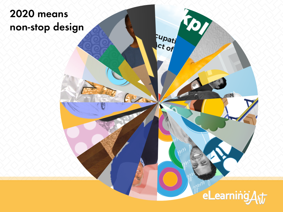
To help you make sure that your projects have that “all-new decade” look and feel, we’ve done the work for you by sorting out predictions made by across the internet. These are the steps we took:
- We captured the top lists of graphic design trends for 2020 and continue to update it
- We distilled these lists down for trends that apply to slide-based project creation.
- We delivered our own shiny new list showing the trends in action … read on!
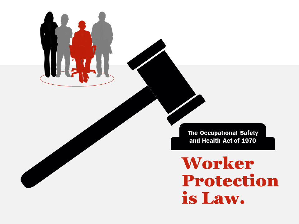
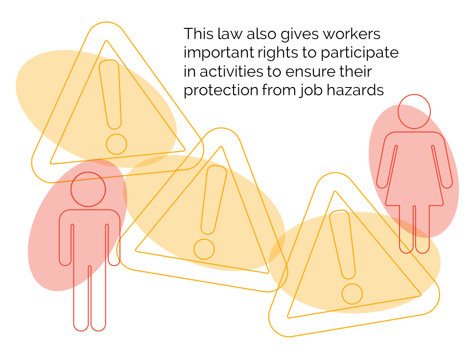
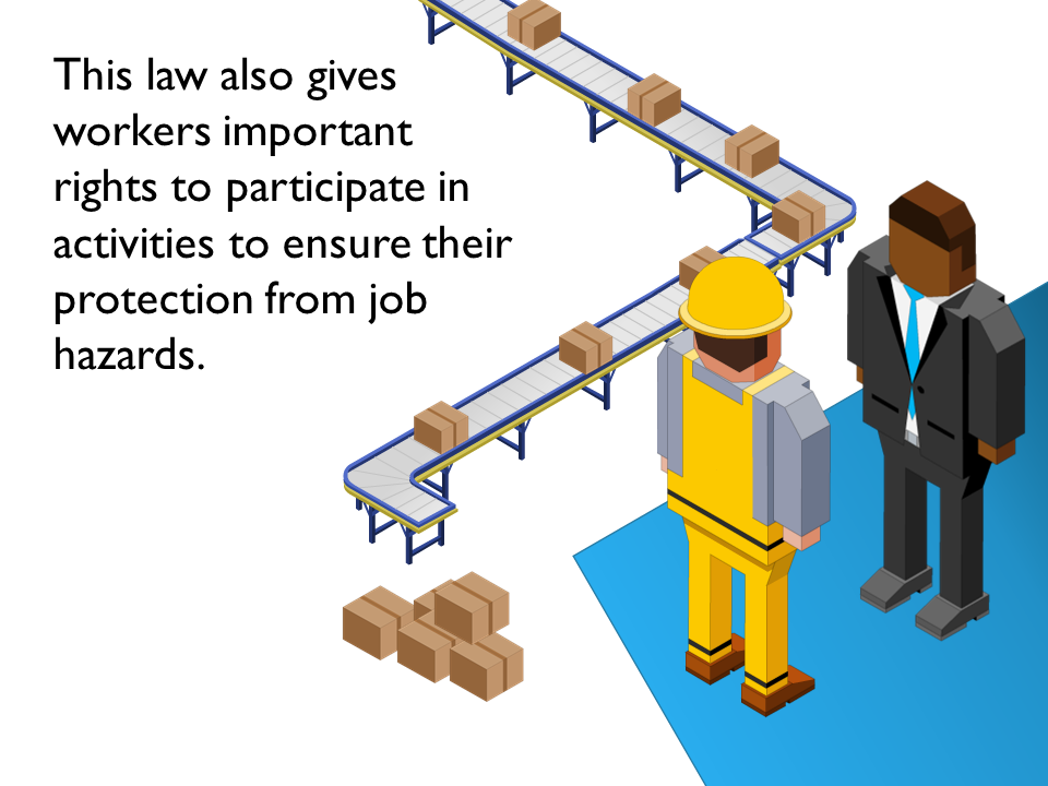
To illustrate the trends here, we’re making over a single slide from a public domain slide deck offered by OSHA. Informational, great as a start if you need to present on the subject, but a wee-bit old school and, yeah, a little text-heavy.
A couple of things to know about our examples:
- We use the OSHA slide as a jumping-off point, but assume that the info it includes could be delivered across several slides. We don’t try to add every point to our thumbnail sample slides.
- We challenged ourselves to use only graphic assets from the eLearningArt library and to complete all builds exclusively in PowerPoint. Challenge met!
OK, let’s start trending!
1: Use an authentic and emotional visual vocabulary.
For a variety of reasons, today’s graphic design relies on emotionally-persuasive stories about both organizations and the people comprising them. As a result, the new overall look and feel avoids the slick polish of yesterday’s stock photo-rich visuals. In fact, it’s on-trend for today’s graphics to show what it is that makes our workplaces authentic, diverse, and inclusive, even if the result is a little more “real” and emotional than what we typically build.


2: Choose a design theme at one extreme or the other.
Trends affecting the overall approach to slide layouts, including use of white space, placement of content, and the quantity of objects on-slide tend toward two opposite extremes. On one hand, there is a strong pull toward minimalism — lots of white space, careful grid-based compositions, and fewer objects per slide. On the other, we see maximalism, with more densely packed slides, and frenetic and unpredictable positioning of lots of objects. Minimalism connotes a calm and controlled serenity, while maximalism delivers the message with gritty strength.
3: Support your design theme with a color strategy.
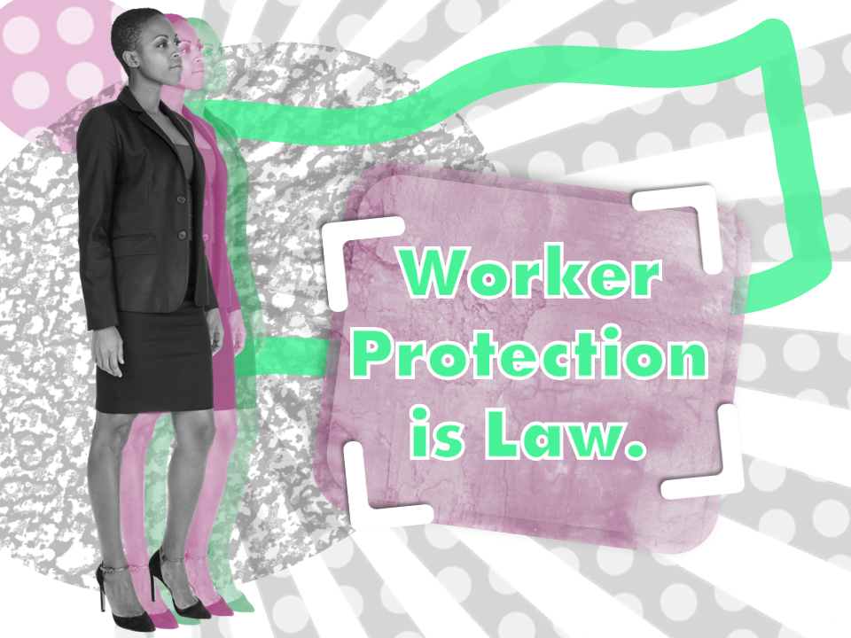
This year, there seems to be little consensus around which colors are on-trend, but there are certainly some options for what you can do with whatever colors you choose! We’re categorizing these trends as “color strategies” and they give you some neat options for the use of color across your program.This year we’ll be seeing lots of monochromatic, with one color (and possibly its family of tints and tones) predominating over a white background, and “duotone,” where photos processed to one color are set against a background of a different color. Two old standbys — color gradients and bold color blocking — are also popping up this year.


4: Choose your color palette.
Depending on your subject, design theme, and audience, you can make a choice from a wide range of trendy color schemes, including earthy neutrals, muted vintage, bold and contrasting, and brightly vibrant or darkly punkish. Combine these with creative color schemes discussed above and you’ll have a winning combination!


5: Go bold with type.
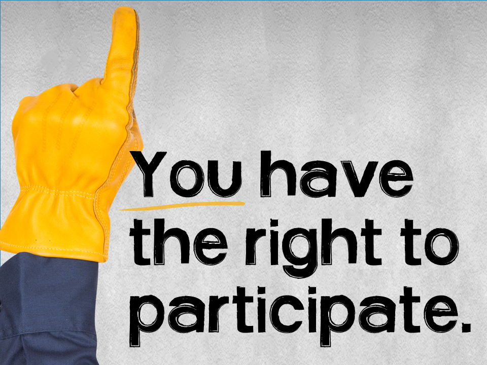
We’re seeing a big explosion of design that uses typography as a featured element. Trends toward heavy, simple fonts, sumptuous, brushy hand-lettering, and charming, well-built serif fonts are all making their way into today’s visuals. In some spots, we see a greater emphasis on type-based approaches — think yesterday’s newspaper layouts, with up-to-date usage of white space and letter weights. (One note though. Keep in mind the challenges of ensuring your program appears exactly as you’ve designed it no matter where it is viewed. In our world, sticking with web-safe fonts like Arial, Verdana, Cambria, and Georgia is still the worry-free option.)
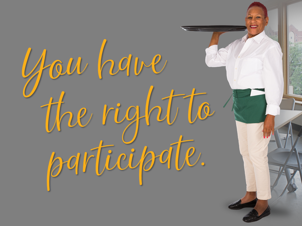
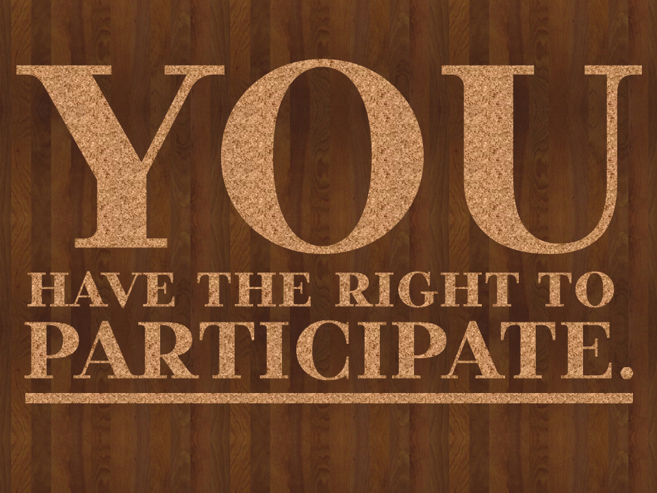
6: Add rich interest to shapes and surfaces.
One quick route to a more sophisticated look and feel is to add depth and interest to shapes and surfaces. This trend appears in several different ways, from the use of old-school shiny metal surfaces on shapes and fonts, the addition of surface patterns (halftone dots, gritty textures, or subtle seamless embellishment) to graphic treatments, and the choice of smooth and swoopy shapes (often with depth-enhancing color treatments) that bring movement and liquidity to the screen.


7: Create the illusion of depth.
Current trends are building on the use of real, depthy scenes that give a feeling space as you look at the screen. This trend is supported by new capabilities in 3D manipulation that deliver a surprisingly realistic visual experience even in a commonly-used apps like PowerPoint. In addition, familiar tools like shadows, bevels, chisels, and gradients — present in most of the authoring tools we use daily — put amazing depth-building abilities on all of our desktops.

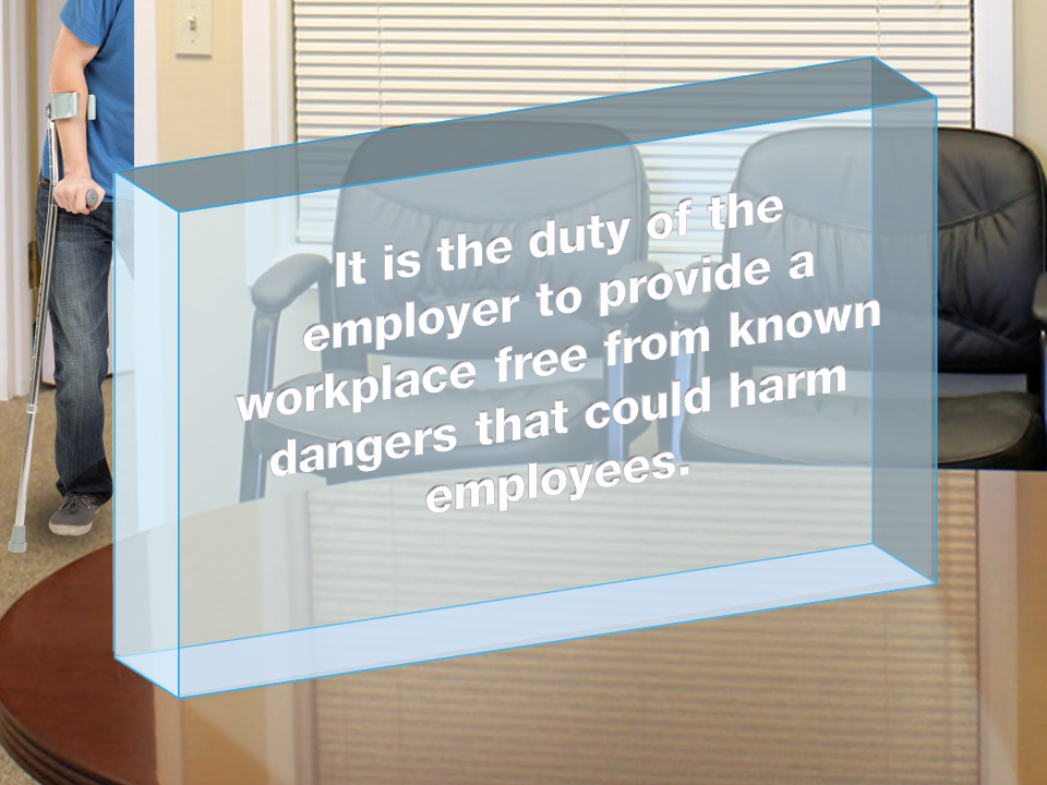
8: Mix image mediums.
This year, we get to say “Who sez?” about what goes with what! Screens are looking more interesting as we see a trend toward combining various image mediums in single frames. Think hand-lettered text and drawings over a photo, mixes of photos, drawings, and even fine art, and geometrics combined with images. The key word here is “collage.” You set the volume — it can be subtle and a little retro, or bold, graphic, and disruptive.


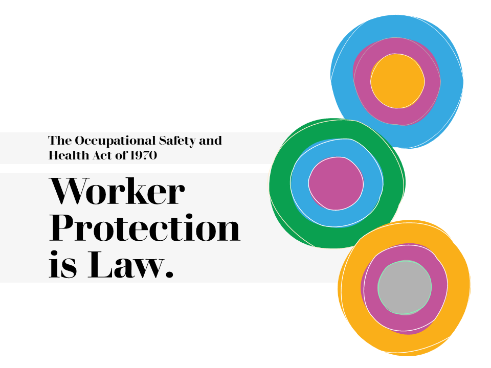
9: Add charm with illustrations.
We’re seeing them everywhere on the web: charming illustrations used to convey concepts, ideas, and emotions. Some of these are part of a trend toward simplified and ultrathin line art, and others are big, bold, and colorful illustrated characters. Isometric illustrations are making a comeback this year, too, delivering a slightly computerized look and feel that matches well, we think, with technology and internet-related topics.

10: Manipulate images for effect.
Today’s tools give us a wide world of possibilities for upping our image game, and this year’s trends point the direction. Consider masking images with text or graphic shapes (possible now in PowerPoint, for example), creating cutout paper effects, or changing photos to colorful semi-transparent silhouettes. Just a little time in experimentation can create some stunning results, and you’ll be right on-trend for having done it!


And there it is, the top-10 for 2020! Next time you’re thinking through the design of a new program, we suggest you come back to this list and take it from the top!
—-
Special thanks to the great resources that inspired our trends:
Graphic Mama | Venngage | Creative Bloq | 99 Designs | Digital Synopsis | Behance | Just Creative | Muz.li | Merehead | Canva
—-
Trends from previous years: 2018 Trends | 2017 Trends


