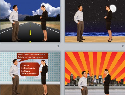
One of the most important elements of good scenarios, quizzes, and templates is the background image. It’s easy to spend hours searching for the right background. One way to cut down on the search time is to build your own backgrounds. In this post, I’ll show you four techniques that I use to rapidly build my own backgrounds. And, of course, I’ll include some source files for you to experiment with.
Stylize backgrounds for visual interest and contrast
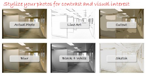
If you’re working with assets in the ideal format, your characters will be separated from the background. Then, as I mentioned in a post about creating contrast, you can stylize background photos to add visual interest. The backgrounds that I created were done in Photoshop with filters and effects. Here’s what I had come up with:
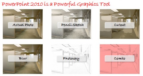
If Photoshop makes you sweat, then you’ll be happy to know that starting in PowerPoint 2007, there are a number of pretty useful filters you can do to “recolor” your backgrounds and PowerPoint 2010 adds a number of new effects. Here are some examples of the some background effects you can create in in PowerPoint.
For the stylized backgrounds to work well, I’ve found that it works best to shoot backgrounds without any people in the background. If you want to try creating your own effects in PowerPoint, here is a video that shows you how to do it. I’ve also included the source files here.
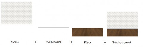
Mix and match walls, baseboards, and floors to build your own scene
A few months ago, I saw a really cool screencast by David Anderson. When David creates backgrounds, he looks at three different elements: floors, baseboards, and walls. After watching his video, I had my team go back and create variations of these three elements. You can get some really cool results based on different combinations of these elements.
You can mix and match the different floors, walls, and baseboards to come up with some interesting combinations. Here are four quick examples:
Here’s a video showing you how to work with walls, floors, and baseboards.
If you’re looking for more ideas of what you can create, you can see our combos of walls, baseboards, and floors here. I also put together a source file of a wall, floor, and baseboard here so that you can see if this is approach that would work for you.
Combine textures and colors to create backgrounds
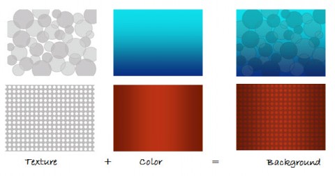
I really like this technique for creating backgrounds for templates. Essentially, you’re taking a texture that has both shades (light or dark) and transparency. You then layer that on top of a color scheme to create a new background style. This is what the process looks like:
Here’s a video that shows how I layer the textures and colors in PowerPoint.
Note: the textures I used above are part of my library of textures and colors, but you can create your own textures in PowerPoint but doing a texture fill, then adjusting the transparency levels. Here is a source file based on the video above that has a texture and a color to create the background. Note: in PowerPoint, you’ll want to insert the texture by drawing a rectangle, then doing a picture fill. That’s the only way you can control the transparency levels in PPT.
Stretch repeating patterns to build background elements
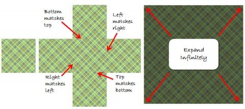
One of the cool features within PowerPoint and other graphic design tools is that you can “tile” a picture. What makes tiles cool is when you make them “seamless.” That means that the left edge and right edge match up, and the top and bottom edge match up. In theory, you can then stretch the tiles into an infinitely large shape. Here’s an example of what this might look like.
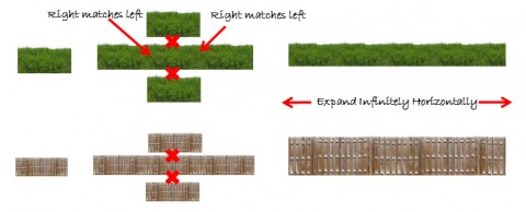
Other useful textures will tile horizontally, but not vertically. For example, you might want to put a layer of grass on top of another surface. You could stretch it out horizontally like this:
You can see from the two examples above that it’s possible to seam both textures and pictures. It takes some skill to build these, but they’re actually pretty easy to use. Check out this video that shows how I used textures to build out a few background scenes.
Here are a few of seamless textures and seamless patterns I’ve come up with. If you’re new and you just want to play around with seamless textures, I’ve included a free seamless texture here. Also, most graphic design programs, including PowerPoint, have some built in. You can also get them from other stock photo sites. I’ve also seen a few websites that have free textures. Just make sure you understand the license before using them in a published course.
Wrapping it up
Searching for the perfect background image can be frustrating. I think it’s both faster and more visually interesting to create your own background scenes using the techniques above. I hope you found that useful.
How do you create and use background images in eLearning courses? Share with us in the comments section below.

