You only have one chance to make a first impression. That’s why the intro, or “splash” screen, is arguably the most important slide in your eLearning course. While it doesn’t change performance, it does set the tone for the learner’s experience. “Does this course look like it is well designed or just thrown together?” The learner answers that question in the first few seconds.
The goal of the intro screen
When I build a splash screen, I attempt to:
- Depict the meaning of the course in several seconds
- Create a good first impression
- Catch the attention of the learner (visual interest)
- Create a call to action (note: the examples below don’t all have these as you’ll have to decide what the action is, such as clicking a “launch” button or opening a gate screen with instructions)
Sounds easy enough, but what if you’re not a graphic designer?
It’s ok if you’re not a graphic designer
The problem is, most of us aren’t graphic designers, so creating a decent looking intro screen is a challenge. I can think back to my own struggles when I used to build courses. I’d spend way too much time on the intro slide and often ended up with something that I wasn’t all that happy with.
You’re in luck! All of the examples below are created in PowerPoint using some assets and built in PowerPoint design features.
Designs follow common patterns
Recently, we created 50 editable eLearning intro screens in PowerPoint for our members and there were a few themes that were repeated. What’s really nice about these 6 styles is that all of them have several elements that can easily be changed to create new variations. Swap out a character, background image, or text and you have a new look. Hopefully these designs will inspire you in your next eLearning course.
Create a scene with multiple characters
I like building scenes that depict the overall meaning of the course. If you’re building out any kind of soft skills training, this can be pretty easy to build with cut out people images. You just pick the emotions that you’re looking for and put them together into a scene.
Use simple icons to portray meaning
The very nature of icons is that they represent an idea, object, or theme. For example, in the image above, it’s pretty easy to see that the topic is phone based. We just took a simple icon, overlaid it on top of a background, and added some text. If you build it in a tool like PowerPoint or Photoshop, it’s easy to go back and change the color, background theme, icon, and text.
Use blank boards and screens to write your message
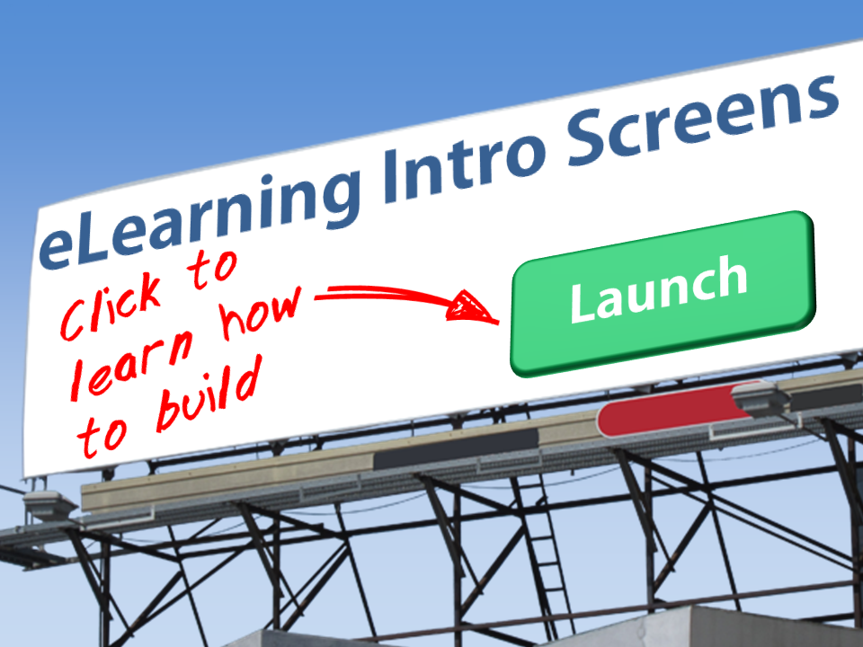
This one is really easy to do. You can take an image of any blank board, sign, paper, etc and customize the text on top of it. If you’ve read our post on how to use display boards to show eLearning content, this concept won’t be new to you.
Use an avatar to introduce the course
You might also consider using a character as an avatar to introduce your course. Some of my favorite (and flexible) poses are talking and thinking because you can swap out any of the elements (background, character, or text) to easily create new variations. I often do this for the header images in the blog as well. You can also just have a character standing on the screen, then use them throughout the course as an avatar.
Use text in interesting ways
The example above combines a few of the concepts already mentioned. We’ve used a character as an avatar, and a board, but then added in some interesting text effects. The fonts in this design are pre-installed in most applications. By just playing with sizing, color, and shadow effects, it adds more visual interest than a standard splash screen. Even without the character or the board, it would stand out from unformatted text.
Use silhouettes
Silhouettes create nice contrast, but also shift the focus to the rest of the slide. You aren’t focused as much on the facial expressions or details of the person, but rather the overall action of the character.
Which of the 6 approaches to splash screens do you like best?
Thanks for making it this far.
If you like the article (or the free files), please do me a favor and let me know which of the 6 styles you like best in the comments below!


