In a previous post, I talked about 10 ways to use characters in your eLearning courses and also gave away 100 free character images.
One of the uses I mentioned was the intro or “splash” screen.
I’ve said it before, but the intro screen is the slide that I spend the most time designing in a course. It sets the tone for the quality and topic of your course.
I took a look at some of the intro screens I’ve designed in the past. And I also looked at some of the course titles you filled out in a survey and created some new ones.
I found that the character intro scenes fell into 6 categories
- Facial expressions & poses to depict meaning
- Compositing a scene to tell a story
- People and outfits that align with your audience
- Generic poses to emphasize text
- Visual metaphors
- Avatars to introduce the course
Hopefully this framework and these examples will help you as you build your own intro screens.
Use facial expressions & posture to convey emotion
Humans can immediately interpret emotion through facial expressions.
It’s pretty amazing, actually.
Happy, bored, confused, thoughtful, angry… Our brains process facial expressions into emotions in microseconds.
That’s one reason characters are great for creating intro scenes. Before our eyes even look at text, the character emotions convey meaning to us.
Without looking at the title of the course, do you get a sense for what these examples would be about.
And don’t be afraid to pick poses that are more exaggerated for an intro screen.
You’re trying to tell a visual story through facial expressions, so don’t be subtle.
You can use more subtle poses for in the rest of your course. Or not!
Tell your story by compositing a scene
Image compositing is one of the most powerful aspects of character sets with the same person in many poses.
Let me explain…
In our free giveaway of 105 images, there are actually 18,000 2-character scenes you can build. Pretty crazy, right?
And if you look at full eLearningArt library, there are over 25 billion 2 character scene combinations. (my math-nerd friend Alan did the calculations).
Instead of sorting through 10 million photos on a stock photo site to find the one or two that work, you’re inverting the process to create flexibility. You start with the character and and pose you want, then mix it with another person, and put it onto the background of your choice.
A few weeks ago, a reader shared that they were working on a course titled “Managing Conflict in the Workplace.” I borrowed from a previous design to create this:
Here’s another example of a 2-person scene:
It can be also be a single character you composite with a background:
The general point I’m making is that compositing gives you a lot of design flexibility. Plus it can be a lot of fun, especially if you’re an eLearnign nerd like me. 😉
Use people and outfits that line up with audience
In addition to using expressions, outfits also convey meaning.
If you’re looking for a course targeted at medical school students, how about a picture of a young doctor in a labcoat?
If you’re doing a course about factory fire prevention, how about a picture of a guy in a uniform?
A business course?… You get the idea.
Here’s an important tip for for picking characters that line up with your audience:
Pick a “realistic” looking person.
Ask yourself: “Can my audience picture this character as one of their coworkers?”
A lot of times, you’ll be getting “models”on stock photo sites. Some studly looking dude or a beauty queen as an industrial worker might not fly! So a “normal” looking person in the right outfit is the best bet.
Show the proposed character to a few people in your target audience and see what they say.
Use generic poses to emphasize text
While emotional poses can draw attention to the character, generic poses can emphasize text or another on-screen element.
Here are the five poses that I frequently use to emphasize an on-screen element:
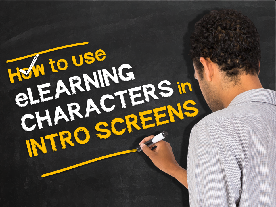
Writing on a board:
Here’s the one I actually used for the header of this blog post:
Over the shoulder
Holding a sign
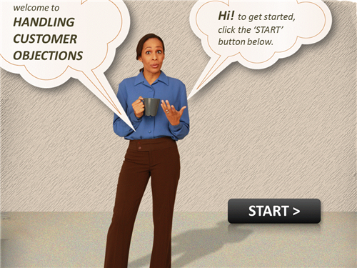
Speech bubble or thought bubble
Pointing at something
Use a visual metaphor
Visual metaphors are also a great way to quickly depict meaning. You can have a lot of fun with these. Check em out:
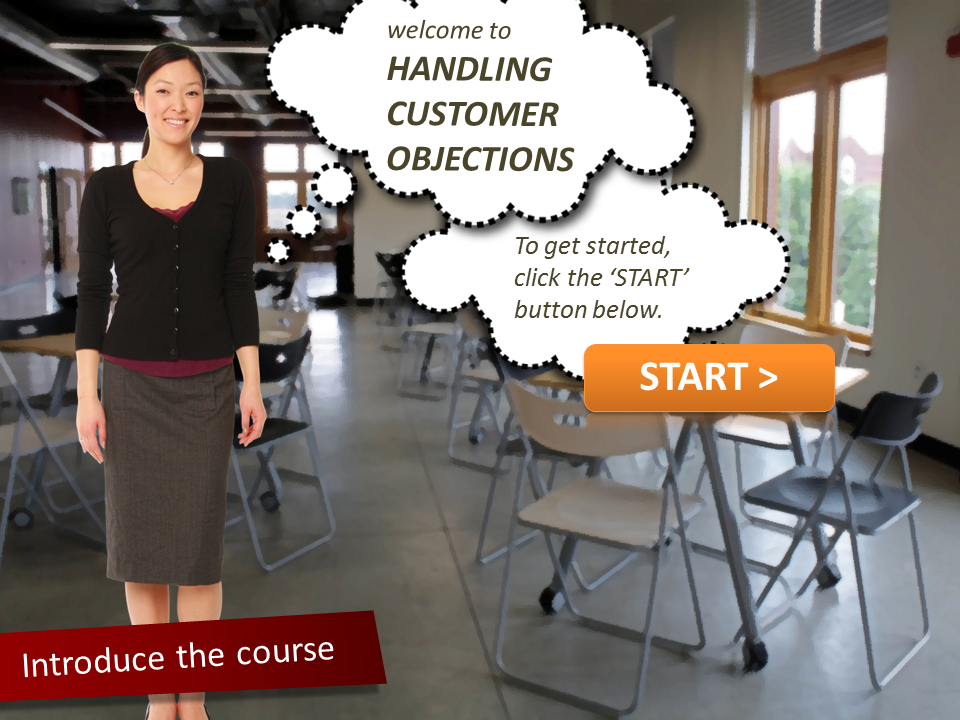
Use an avatar to introduce the course
If you’re using an avatar in your course, it makes sense to include the avatar in the intro screen.
What’s the title of the course you’re working on right now?
Share the title of the course you’re working on right now in the comments and I’ll help you brainstorm some ideas.


