When you have an eLearning project assigned to you, sometimes you jump right into building training without really thinking about how people learn.
We all do it…. Because sometimes you just have to meet a deadline.
But there’s a better way…
I cornered eLearning industry expert, Julie Dirksen, and begged her to share practical tips about how to align the training we build with the way people learn.
In the interview below, Julie explains more about the unique approaches you should take depending on what you’re trying to teach or the problem you’re trying to solve.
What common mistakes do people make when designing training?
So many people come to training via subject matter expertise. They know a lot about their topic, so somebody asks them to teach it to other people. The challenge is remembering what it was like to NOT know something, when you know it so deeply. Often that leads to not starting a basic enough level, or putting in too much information.
Another common mistake is misunderstanding what the basic DNA of learning experiences is. The message we get from our technology (the authoring tools and the learning management systems) is that learning is fundamentally about delivering content. It’s not. If learners want content, they can google the topic and get a million hits of content right now.
The basic DNA of good learning experiences is trying to do something and getting feedback. I think if instructional designers considered themselves first and foremost designers of feedback systems, our training would look very different.
And how do people actually learn?
<laughs> Well, I did write a whole book on that. It’s complicated because the best solution depends on what the problem is that you are trying to solve. For example, a straightforward procedural training piece might be served well by a quick video or a good job aid. Complex skills development, on the other hand, really requires a learning process over time with good opportunities to practice and get feedback.
Chris Dede, a learning technologies professor at Harvard, has this great analogy. He talks about how things can be like sleeping, eating or bonding. If you want to design a good solution for sleeping, you need to design something that is safe, dark, quiet and comfortable. As long as it has those characteristics, you are probably okay. Eating is a bit more complicated. Are you designing for breakfast, lunch or dinner? Is it a casual meal, or formal? For an individual or a group? For a particular culture. There a lot of variables you have to consider before settling on a design.
Bonding is even more complicated. A solution that would be great for romantic partner bonding would be wildly inappropriate for co-worker bonding, and vice versa. Bonding looks different depending on the stage of the relationship, the context, the people involved. Teenage boys might bond quite happily by punching each other on the arm, but that’s a really bad solutions for bonding with your boss or your Aunt Edna.
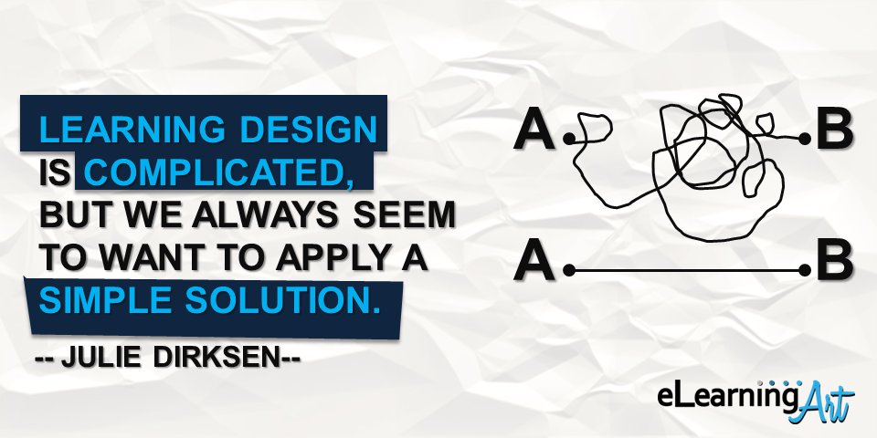
Learning design is probably as complicated as bonding, but we always seem to want to apply a simple sleeping solution to the problem. Maybe flipped classroom is going fix everything. Or MOOCs! Or gamification! Well, of course not. It’s much more complicated than that. There are a number of variables you need to consider, and those tools might be good solutions in some cases, but definitely not all.
How do we design for how people learn?
An example of one such variable that I’ve been working on in my own practice — is the skill primarily tacit or explicit? For example, the skill of take a blood pressure reading is pretty explicit. There are well-documented steps and procedures, and we know what criteria to use to evaluate it. An example of much more tacit skills would be reading customer reactions to a sales pitch. How does a good salesperson know when to close the sale? Well, they could tell you some explicit buying signals, but probably the real answer is they just know. Experienced people have seen lots and lots of customers and have developed a sense. The implication for instructional design is that if it’s a tacit skill, as a learning designer you’ll probably need to design a way for new learners to see multiple sales conversations, so they can develop their own sense of that. You can’t just explain it to them — they need to see it, and probably several times.
How is eLearning design different than visual design?
They are overlapping circles, I think. There’s no questions that good visual design makes learning better. Donald Norman wrote a book a few years ago called Emotional Design, and one of the questions he examined was whether or not more attractive interfaces work better. His conclusion from the research was (all other things being equal) that yes, more attractive things probably do work better. It may be because the more attractive interface creates a positive feeling in the user, which makes them more open and patient.
The big –often untapped — opportunity in the visual design of elearning is creating context. We know from quantities of research that the closer the context of learning is to the context of use, the more likely the behavior will be recalled and hopefully transferred. So, for example, if you study in the same room where you take the test, you will likely remember more than if you study in a different environment than where you take the test. This has so much potential in elearning. If you are going to use the knowledge on the shop floor, then use pictures of the shop floor in your elearning. This is why I’m not a big fan of themes. If you use a football theme to make manufacturing processes more interesting, then when are users likely to remember the material? At home, on the couch on Sunday watching the game. Not really the most helpful scenario.
What’s one practical tip we can implement today?
Get your subject matter experts to tell the story of how they learned their area of expertise. Ask them how they practiced and got feedback. Ask them if they learned it quickly, or if it took a long time. If a subject matter expert tells you it took a long time, and they had to get it wrong a bunch of times, then that tells you that your learners probably need multiple interventions over time, with good practice and feedback opportunities. It’s not that you can’t improve on how the SME learned, but if it took them two years with lots of practice, you aren’t going to pass that skill on to new learners with a 15-minute elearning course.
Where do you look for design inspiration?
I spend a lot of time checking out what the user experience (UX) people are doing. There are so many good examples of design thinking in that community. Stephen Anderson is one of my favorite UX people. Any time he puts up slides from a talk, I scurry over to check them out. My current biggest nerd area is behavior change. There are so many great people working in that space. Dustin DiTommaso and Dan Lockton are both doing great stuff. Sebastian Deterding is technically a games scholar, but his stuff is really about motivation.
What design or eLearning blogs do you routinely read?
I follow people more than blogs these days. I never really recovered from Google killing Google Reader. The best blogs in the industry, particular for newer people, are Tom Kuhlmann’s Rapid Elearning Blog, Connie Malamed’s elearningcoach.com, Cathy Moore’s blog, and Jane Bozarth’s Nuts and Bolts column for Learning Solutions magazine. Cammy Bean’s blog is also great.
It’s defunct now, but trawling through the archives of the Creating Passionate Users blog is worth anybody’s time. Kathy Sierra is probably the person who has been the biggest influence on me as an instructional designer, along with Michael Allen.
What books would you recommend?
I have a reading list on my site that I update periodically.
What are 3 example when training isn’t the solution?
Hmm, usually it’s only part of the solution. First would be any time a job aid would work just as well or better. Second is when it would be better to fix the system or process, rather than trying to fix the users. If you want to reduce spillage when materials are transported, you can try to train people, but you might do better to improve the transport containers.
Third – any time there’s an absence of feedback or incentives. I was talking to a client who wanted to put something in a course about the importance of accuracy when entering loan applications. I asked how the data entry people were incented, and he told me that it was based on how many applications they could do an hour. The data entry people did not get any feedback on their accuracy. That’s a case where we can talk about the importance of accuracy in the training until we all expired from exhaustion, and not much would change.
How does an eLearning designer identify what design approach to take?
Again, that’s a complicated question! I’m not going to give you a sleeping answer to a bonding question! 😉
You talk about designing for attention, knowledge, skills, motivation, and environment. What makes each unique?
Okay, I’ll give it shot. <deep breath>
First, the single most important factor in attention is giving people something to do with what they are learning — give them a problem or challenge up front and then give them access to the material what will help them solve the problem or challenge.
For knowledge, spacing and context are necessary — how do you make sure the learner understands when and how to use the knowledge, and get multiple exposures to it spaced over time?
For skills, the most crucial part is practice and feedback with increasing challenge and complexity over time — look at how video game designers develop their players’ skills, and you see what I mean.
For motivation, I’m a big believer in having a visceral experience of the consequences, and in seeing what others are doing (social proof).
For environment, it’s asking the simple question — is there anything we can change in the environment to make the learners more successful, and is that easier (in some cases) than trying to change the user?
——–
A special thanks to Julie for sharing all of these useful tips. If you’d like to get more information about Julie, you can check out her Usable Learning website or follow her on twitter at @Usablelearning.

