Building presentation skills is one of the most important things you can do in your career.
But it can take a long time to master.
So I decided to save you some time and asked the world’s leading presentation experts the the following question:
What’s your best presentation tip?
It turned into an awesome 2,000+ word detailed blog post. But I didn’t stop there…
I know you’re busy…
So I summarized all 21 presentation tips into 78 seconds of video (also embedded above).
Then you can dig into the full post below, or jump to the section you’re most interested in:
Design Tips | Build Tips | Delivery Tips
You’ll see responses from some amazing presentation authors, consultants, professors, bloggers and PowerPoint MVPs!
Presentation Design Tips
The (secret) way to engage your audience… Use pain, gain or fear.
The (secret) way to engage your audience… Use pain, gain or fear.
Decisions depend upon these three motivators. Summarize your presentation (i.e., your takeaway) to include one of these.
I like gain because it is a positive emotion. For example, your takeaway may be, “Improve cash flow by doing this one thing.”
Share your takeaway early! This gives your audience a reason to care about your presentation so that they will pay attention.
Mike Parkinson, Billion Dollar Graphics
Start by asking: What do I want my audience to know, feel, and do?
To me, all effective high stakes communication must be goal driven.
A goal has three essential parts: information, emotion, and action.
Regardless of if you are writing an email, preparing for a meeting, or giving a talk, you should start by asking: At the end of my communication, what do I want my audience to know, feel, and do?
Not only does this goal provide you with direction. It also gives you a way to assess your communication success. It creates a metric against which you can compare the outcome of what you say.
Being clear in your communication goal reduces rambling, increases confidence, and helps you to structure and audience-centric, engaging message.
Matt Abrahams, BoldEcho.com & NoFreakingSpeaking.com
Never forget your “why.” It drives your talk and makes you relatable
Never forget your “why.”
The “why” drives your talk and makes you relatable to your audience.
It shines a spotlight on what SHOULD be on the slide greatly increasing your signal-to-noise ratio.
Stephy Lewis, Presentation Workshop
Practice KISS (Keep It Simple, Stupid)… Keep your presentation content clear and concise
Practice KISS (Keep It Simple, Stupid).
Reign in your inner magpie and keep your presentation content clear and concise without sacrificing style.
Avoid cognitive overload [with] the “1 concept per slide” rule
I ask my users to remember that “PowerPoint Audiences are People, Too,” reminding them that all humans learn in a specific way — and cluttered slides do not facilitate that learning.
While I offer several tips to avoid clutter and cognitive overload, the one I ask them to remember above all else is the “1 concept per slide” rule. It’s a great and easy first step into uncluttering their slides.
Sandra Johnson, Presentation Wiz
Keep a digital inspiration notebook…for fresh presentation ideas
Keep a digital inspiration notebook (try OneNote or Evernote) that you can turn to when looking for fresh ideas for presentation concepts.
Divide your notebook into sections based on various design elements such as: colors, typography, shapes, and so on. Inspiration can be found everywhere.
Capture new finds with your phone camera and send directly to your notebook app.
Julie Terberg, Design To Present
Go outside your discipline and look at other design pieces.
This tip is for those not 100% confident in their design (and even a refresher tip to those that are!).
Go outside your discipline and look at other design pieces. Look at website design, magazines, catalogs, animations, filmography, posters and practically any form of visual communication that has a direct purpose.
Describe the things you like about it. Write them down. Detail all the things that don’t sit well with you. Look for the harmony and the disruption and describe it.
If you have time, try and recreate it using PowerPoint, down to the nearest pixel.
You’ll start noticing the subtleties of design that pull a harmony together. Maybe it was a feather-light drop-shadow, or maybe it was the exacting consistency of spacing between multiple areas.
The more you can practice this exercise, the more information you’ll have about the design process and what works and doesn’t work in other disciplines and the better equipped you’ll be to implement the subtleties of design into your work.
Tom Howell, Synapsis Creative
Focus on your audience, and align their needs with your objectives
Focus on your audience, and align their needs with your objectives by showing that you understand their situation, demonstrating that your ideas help overcome their challenges, and indicating the real benefit to them in changing their behavior as a result of your presentation.
Audience-focused stories are so much more powerful than traditional ‘me, me, me’ approaches.
And by starting off talking about your audience, and continuing to frame everything from their perspective, you provide context and relevance which is really engaging and effective.
Richard Goring, Bright Carbon
Com[e] up with a strong, sound…design first, then build that design (no matter the tool)
I like how at the Presentation Summit, “Build” and “Design” are two separate tracks; they need to be kept a little more separate sometimes.
In elearning, when working and learning how to use a tool, be it Storyline, Captivate, or even PowerPoint, those tools can be rather seductive in dictating the design of the content if we let it be.
But, coming up with a strong, sound elearning design first, then building that design (no matter the tool), testing the design and redesigning the system based on user data–those are the designs of the future.
Presentation Build Tips
Section Dividers or Theme Dividers – Use Them!
Section Divider or Theme Divider – Use Them!
I obsess over the concept of “no old content.” Often it is literally old content, like outdated financial data from a previous deck. But while presenting, it is about leaving no ‘old content’ on-screen when the talk has moved beyond that content.
As example, the presenter covers those financials and transitions the talk staffing – with no slide change. The financials are “old content” and there is now no connection between on-screen and talk. Use Section Divider (minimal text) or Theme Divider (no text) slides to provide visual cues that there is nothing on-screen of importance and focus on the presenter.
Troy Chollar, The PowerPoint Blog
Slide title facelift: 1. Left-align, 2. Unbold, 3. Use sentence case
Modernize your deck in three steps
The bold, centered slide titles I see in more than half the decks that cross my desk are so 2003. And Title Case, Where You Capitalize Every Word, Is Totally Out of Style, Man.
Give your deck an immediate facelift by applying these styles to your slide titles:
1. Left-align
2. Unbold
3. Use sentence case
If you like shortcuts, you can use this sequence: select the title text (triple-click or CTRL+A) and then CTRL+L (left-align), CTRL+B (unbold/bold), Shift+F3 (Sentence case/UPPERCASE/lowercase).
Better yet, make the change to the title placeholder on the slide master to quickly bring your deck into the 21st century.
Echo Swinford, Echo’s Voice
Stop complaining that PowerPoint can’t do something
Stop complaining that PowerPoint can’t do something you want it to and instead, do something about it. Go to powerpoint.uservoice.com and leave your feature requests where others can vote on them (and where you can vote on other people’s ideas as well.)
Believe it or not, the PowerPoint development team actively monitors this website and will often reply with questions, updates or explanations such as “”feature in development.””
Of course, this isn’t a magic genie, and there’s no guarantee anyone’s request will be acted upon, but believe it or not, some of the best new features introduced recently began as requests from users on this board.
Nolan Haims, Present Your Story
Combine 3D and 2D Animations in PowerPoint
Combine 3D and 2D Animations in PowerPoint.
Microsoft recently released some amazing 3D animations to use with their 3D models in PowerPoint 365.
These look fantastic by themselves, but for extra spice, you can combine them with good ol’ 2D animations as well.
Motion paths, in particular, make for nice combinations, such as a spaceship that spins around in 3D while it flies, as well as a dog jumping over a fence (using the 3D “Jump and Turn” 3D animation on the dog, and a 2D Wipe down exit for the front fence layer).
Lia (P-Spice)
Learn to use Duplicate. Did you know that it’s smart?
Learn to use Duplicate. Did you know that it’s smart?
Duplicate an object and move the duplicate relative to the first object. Now duplicate that new object. Note that it automatically remembered the adjustment you made in the first duplication!
Play with it and the time savings will become obvious.
Use “video round tripping”… an animated slide you export to video and reinsert into PPT
Round tripping of video. Build an animated slide and export that slide as a video. Then reinsert that video onto a PowerPoint slide.
You can use the video timeline to add new animations.
Or what is really cool? Export slides that are setup with slide transitions to a video. Then, when you reinsert that video into PowerPoint, you get transitions on the video.
There is a video available that shows how to do it.
Presentation Delivery Tips
Practice [your] talks when [your] content is about 80% done
Get on your feet” sooner, rather than later!
I urge my speakers to get up and practice their talks when their content is about 80% done.
Why not wait until it’s more complete?
Because there is golden learning that can ONLY happen on your feet, and it’s often learning that informs all of those final tweaks and personalizations, that helps you integrate your content and bring your most authentic self to the moment.
Instead, many people spend the last 20% of their development time “perfecting” their talk (or, probably more accurately, avoiding the awkwardness and challenge of rehearsing!), and then get up on their feet only to find those “perfect” words don’t *feel* quite right. Ugh.
There’s a lot we only learn by getting on our feet, so do it before you’re ready!
Sally Zimney, This Moved Me
[Distinguish] what you say, what you show, and what you give.
A good presentation is made up of three things: what you say, what you show, and what you give: what you say to your audience when you are before them; what you show them, in terms of slides and visuals; and what you give to them, in the form of a printed handout.
When presenters don’t distinguish these three tasks, they end up creating Death by PowerPoint. When they make each of these as good as they can possibly be, great things can happen and they end up distinguishing themselves from 99% of those people giving presentations today.
Rick Altman, Presentation Summit
Panel discussions have the power to be pervasive, surprising, engaging, and unscripted
Panel discussions have the power to be pervasive, surprising, engaging, and unscripted, with a behind-the-scenes view of subject matter experts sharing provocative thinking.
The key is, meeting planners, panelists, and moderators must collaborate to prepare effectively to create these moments.
When you select a topic of interest to the audience, a skilled moderator to facilitate the conversation, and intriguing panelists with diverse viewpoints, then you can have a brilliant panel discussion.
Kristin Arnold, Powerful Panels
Keep the audience as the focal point of your presentation at all times
Keep the audience as the focal point of your presentation at all times (design, build and delivery).
It is tempting to try to show off our own skills (as a content designer, as an expert in the software, and as a presenter).
Instead, focus on what your audience needs from you and what you can do to make sure that they walk away from the presentation with that one thing.
Share presentation control: the speaker uses a remote clicker and you use a wireless mouse
Is your speaker using a remote clicker to control her/his presentation? Plug in a wireless mouse and hang onto it yourself.
You can click on hyperlinks for the speaker if need be, and if they accidentally do something wrong, you can use the mouse to put things right.
I’ve found that they work from a reasonable distance and don’t mind “sharing” with remote clickers.
Steve Rindsberg, PPTFAQ.com
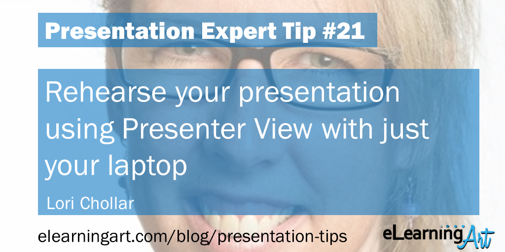
Rehearse your presentation using Presenter View with just your laptop
How do you rehearse your presentation using Presenter View with just your laptop to work with? Easy. Start your slide show, move your mouse to the lower left corner and click the “three-dot” icon that appears. Simply select SHOW PRESENTER VIEW from the menu! Now you can see your current slide, next click and your notes for a productive rehearsal.
Bonus tip: when connecting to a projector and running Presenter View, if things go awry with the display setup, click SWAP PRESENTER VIEW AND SLIDE SHOW under the DISPLAY SETTINGS menu at the top.
Lori Chollar, TLC Creative
21 Presentation Tips Summarized
- The (secret) way to engage your audience…Use pain, gain or fear. | Mike Parkinson
- Start by asking: What do I want my audience to know, feel, and do? | Matt Abrahams
- Never forget your ‘why.’ It drives your talk and makes you relatable | Stephy Lewis
- Practice KISS (Keep It Simple, Stupid)… Keep your presentation content clear and concise | Glenna Shaw
- Avoid cognitive overload [with] the “1 concept per slide” rule | Sandra Johnson
- Keep a digital inspiration notebook…for fresh presentation ideas | Julie Terberg
- Go outside your discipline and look at other design pieces. | Tom Howell
- Focus on your audience, and align their needs with your objectives | Richard Goring
- Com[e] up with a strong, sound…design first, then build that design (no matter the tool) | Heather Ackmann
- Section Dividers or Theme Dividers – Use Them! | Troy Chollar
- Slide title facelift: 1. Left-align, 2. Unbold, 3. Use sentence case | Echo Swinford
- Stop complaining that PowerPoint can’t do something | Nolan Haims
- Combine 3D and 2D Animations in PowerPoint | Lia (P-Spice)
- Learn to use Duplicate. Did you know that it’s smart? | Ric Bretschneider
- Use “video round tripping”… an animated slide you export to video and reinsert into PPT | Glen Millar
- Practice [your] talks when [your] content is about 80% done | Sally Zimney
- [Distinguish] what you say, what you show, and what you give. | Rick Altman
- Panel discussions have the power to be pervasive, surprising, engaging, and unscripted | Kristin Arnold
- Keep the audience as the focal point of your presentation at all times | John H. Rahmlow
- Share presentation control: the speaker uses a remote clicker and you use a wireless mouse | Steve Rindsberg
- Rehearse your presentation using Presenter View with just your laptop | Lori Chollar
Thank you to all of the wonderful presentation experts who contributed their tips.


