Synopsis
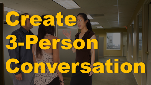
When building eLearning scenarios or stories, sometimes you need more than two people in a conversation. This tutorial outlines the best practices for building multi-person conversations and includes the source files so that you can follow along with the lesson yourself.
Download the source files
Click to [dlink galleries=477,457]download the source files[/dlink] for this tutorial, which includes the PowerPoint file as well as the character images.
[dlink galleries=477,457] [/dlink]
Watch the Video
You can watch the video here.
Transcript
Hey, this is Bryan Jones from eLearningArt. Today I’m going to show you how to build a three character conversation in PowerPoint. In the end result here you are going to have three people in a room in a background and there’s a few different angles that you can do and I will walk you through kind of what works and what doesn’t work and of course I will give you the source files.
You can just click the button below or check the show notes as well for a link and it will include the PowerPoint files as well as all the character images that you see throughout this.
So if you think that’s awesome please give me your feedback and just give me a quick like on YouTube and with that let’s go ahead and get started.
So you will see here we are in PowerPoint and what I have is a background image and then each of these characters are their own character cutouts and you can play around with those files a little bit. But a couple of things that you are going to want to do is… let’s actually zoom out and take a look at what’s going on here. Basically I have a background and I’ve dropped three characters on top of it and you are going to want to make sure you get your proportions right and that the characters are reasonably looking at each other.
And I actually just want to walk through a couple of these to show you what I think works and doesn’t work as I played around with the various angles of some of the images that you will have.
So I think this works where you kind of have one character facing the side and the other back and the other to the side. This works as well where the person who is looking back is facing straight back. This works to when everybody is facing the side but I kind of think that works well.
Here is where we start getting into some problems. When the character is looking directly at the camera, it kind of… it’s like the character is speaking at you, not to the other characters and I found that doesn’t work very well. It doesn’t matter where the other two characters are looking. Your eyes are drawn to the character who is looking at you and it just doesn’t feel right like she is communicating with you. But, you can fix that even if she is facing the camera if you have her looking off-camera. That works pretty well.
So let’s go ahead and actually get into the file a little bit and I will show you some tips and tricks.
Okay so I’m going to go ahead and zoom in here a little bit so you can see what’s going on. And I like to work with the selection and visibility pane open. It just kind of helps me figure out my layers and allows me to show and hide things, move things up and down within the layers and I can show you how to do that in a different lesson.
But I think a couple of different things you’re going to want to do is make sure that the character’s kind of reasonably looking in the same direction. The other is the proportions. You can really mess some things up here. If you have a character that bigger or smaller, it’s going to look like they are closer or further away and the eye really catches that and it just doesn’t feel right. Now same thing if you have her smaller you would think she is further away.
So you will notice with the characters that I was dealing with here, I actually am running them off the screen and I think that works really well. It makes it so there is no conflict between the feet and where someone is standing. That’s usually where you can see if there’s any sort of error so you know something like that looks pretty good.
So I think what you should do is open those source files, play around with the images and see how I’ve set it up, how I’ve aligned it and see what works for you. That’s really what this lesson is all about.
One other thing to note a lot of times people ask like oh, characters are always facing to the right or to the left. How do I deal with that? Well within PowerPoint it’s just a flip horizontal. So, now I have a shortcut on here that allows me to flip horizontal on the quick access toolbar but you can do that from the Home as well. I think it’s under arrange – rotate – flip horizontal and it will change the direction.
So yeah anyways I also do have a bonus download for you guys so if you just click on the link below here on the left there is a whole bunch of free files that you will have access to.
And of course, I would love it if you subscribe to the YouTube channel where you will get updates when I have new lessons and I constantly am giving out free files as well. And feel free to also check out some of the featured videos that are related to this lesson that you might also find useful.
So until next time. Enjoy your files!


