As instructional designers, we’re always trying to make our eLearning courses more interesting, effective, and engaging.
But with a mountain of content to produce, tight deadlines, and a small budget, where do we even start?
That’s why I decided to ask the leading eLearning industry experts to share their single best tip for creating engaging learning.
Their responses are awesome and can be summarized into ten practical tips:
- Use scenarios for real world practice
- Hook your audience through compelling writing
- Make the content relevant to the job
- Add context to show the material in action
- Incorporate media to create visual interest
- Incite emotion to connect on a deeper level
- Tell a story about the learner’s world
- Put the learner’s experience first
- Add interactivity to draw the learner in
- Use micro learning to deliver key messages
The tips and details are delivered below! For added fun, we also did an example slide makeover for each tip. Put it all together and you’re on your way to a great project that your viewers will love.
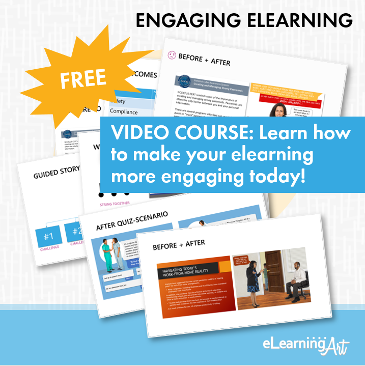
Get our free engaging elearning video training.
Use scenarios, stories, and other tactics to create more engaging, memorable, and impactful training.
1. Use scenarios for real world practice
To deliver effective learning, you want to set up the questions, conflicts, and emotions the viewer is likely to encounter when they put your content into motion. Scenarios let viewers practice the behavior you need them to use, in a context that closely mimics real situations. Using this approach, you can recreate the world of your learner and challenge them to make choices in a safe-to-fail environment.
Interactive Scenario Example

Before: Pushing content via on screen text
Does a slide like this look familiar? Did you just fall asleep? It’s easy to take a script and just convert it into bullet points to fill a slide. Doing that, though, means missing an opportunity to connect the content to its application on the job. For example, this OSHA compliance training on worker rights doesn’t have to be just a bulleted list.

After: Scenario with choice and feedback
Instead, why not make it interactive? Illustrate situations in which a worker might feel conflicted about exercising their rights. Tell that story about it, ask a key question, then give the viewer choices, providing feedback based on those choices. eLearningArt assets used: Designer Cartoon Illustrated Characters and Designer Illustrated Backgrounds.
Want to see more? View our eLearning scenario examples.
Scenario Tips from the Experts
Tom Kuhlmann
Placing a person in a real-life scenario where they get to make decisions (for good or bad) is ideal. However, we know most courses don’t do that. In that case, make them visually interesting and create a story around the content rather than screens of bullet points.
Tom is the Chief Architect at Articulate. He has grown their community to be the go-to industry resource and helps shape the entire Articulate product line. Tom also authors The Rapid eLearning Blog, one of the most followed eLearning blogs, with over 100k+ readers.
Bryan Jones
Having content pushed on us in the form of bullets and slides is clicking boring. What people care about isn’t information, but how to USE the information to do something. Flip eLearning content from “push” to “pull.” Create realistic scenarios that force learners to make decisions. Let the content be pulled through choices and feedback.
Bryan is the President of eLearningArt. He has created one of the world’s largest image and template libraries that helps eLearning developers build better training. You can learn more about Bryan at the eLearningArt blog.
Michael Allen
CCAF! Context, challenge, activity, feedback. Instead of designing by focusing on content (let alone PowerPoint slides) as is so common, we produce engaging e-learning by focusing on the learning experience first and foremost. The most straightforward way of doing that is to 1) define a context that learners can readily see themselves in and therefore relate to, 2) present challenges for learners to handle actively, 3) enable actions that clearly approximate the performance we are targeting, and 4) give feedback, mostly in the form of consequences for each action so learners come to associate different outcomes with the various decisions and actions they might select.
Michael Allen is the CEO of Allen Interactions. He has been a pioneer in the e-Learning industry since 1975. He’s well known for his books, thought leadership, and conference speaking engagements. He holds M.A. and Ph.D. degrees in educational psychology. You can learn more about Michael here.
Tim Buteyn
RELEVANT and FUN! We should all know by now that people really only care about…what they care about. So, who has time for material that doesn’t resonate? Make a direct connection from the new material to information, procedures, or consequences the learner already understands. Furthermore, doing this in a way that’s fun can make training feel more like a diversion than just another mundane requirement. Realistic games or scenario challenges that generate that “let me try again” feeling is the ultimate engagement. We all have enough things in our lives that we dread; don’t make training one of them.
Tim is the President and Chief e-Learning Strategist at ThinkingKap Learning Solutions. He is an award-winning eLearning developer and writes one of the top blogs in the industry. You can read more about Tim and his thoughts on his blog.
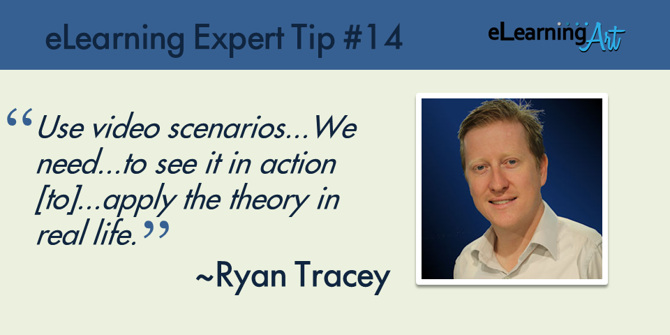
Ryan Tracey
My tip for making eLearning more engaging is to use video scenarios. Far too much content “tells” us what to do, when what we really need is to see it in action. That way we can gain a deeper understanding of how we can apply the theory in real life. I like to show a bad scenario (something done poorly) and contrast that with a good scenario (the same thing done again but following the theory, thereby achieving a better outcome). Branched scenarios add an extra level of engagement yet again, by empowering the learner to make decisions and experience the consequences of those decisions.
Ryan is a popular eLearning blogger and learning experience designer based in Australia.. He holds a Master of Learning Sciences & Technology. Ryan is an eLearning specialist in the corporate sector and is a manager, writer, blogger, reviewer, mentor, and advisor. Learn more about Ryan on his blog.
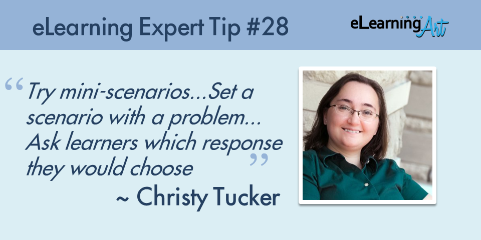
Christy Tucker
Instead of only typical multiple choice questions, try mini-scenarios. Write a few sentences to set a scenario with a problem. A customer voices an objection, software displays an error message, or an employee asks a manager for help. Next, ask learners which action or response they would choose. Now you have a one-question decision-making scenario rather than just an abstract comprehension question. You can do this with any tool, and it creates a more interesting practice or assessment to engage learners.
Christy is an learning design consultant and specializes in using storytelling and technology to engage learners. She writes frequently at her own blog, Experience E-learning, which has been recognized as one of the top blogs in the industry.
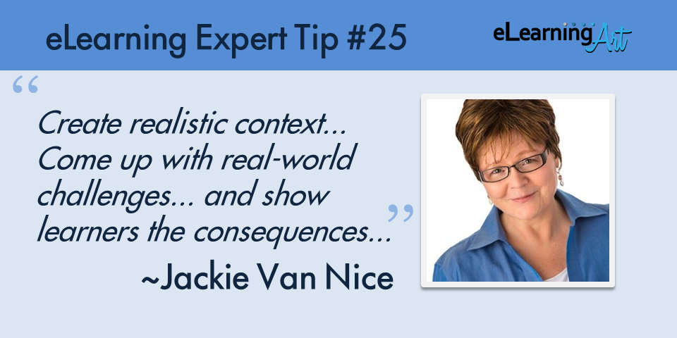
Jackie Van Nice
When designing for learner engagement I make sure I:
1. Create realistic context for the material so that it resonates with learners in a meaningful way,
2. Come up with real-world challenges where the learner must make decisions and take action, and
3. Show learners the consequences of their decisions and actions in the form of feedback, which is also where I’ll focus new material to be presented.
This approach works really well in the form of a game, but it can be used in even the simplest eLearning presentations to make them meaningful, involving, and effective!
Jackie is an eLearning Designer and proud Articulate Super Hero. She creates amazing examples for the weekly Articulate challenges and frequently doles out sage wisdom in the forums. Jackie also blogs about her eLearning experiences on her own website.
2. Hook your audience through compelling writing
Scripting to build interest, to reinforce learning, and to make visual illustration easier will earn you a more engaged viewer. Use short sentences and statements, an active voice, strong verbs, and concrete nouns as much as possible. Think “pictures” not “words” as you’re writing and your building will require fewer tricky decisions.
Interesting Writing Example
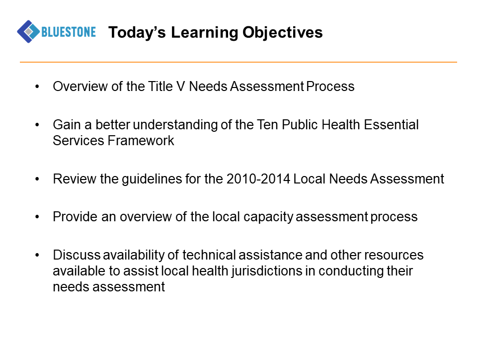
Before: List of objectives
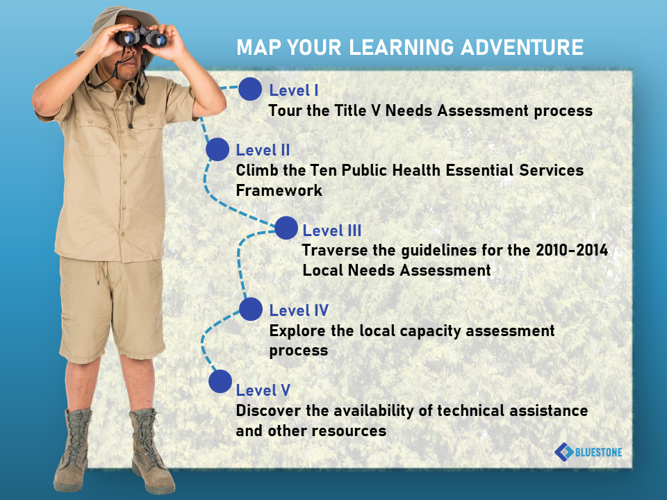
Listing out objectives is a common thing to do in an eLearning course, but, honestly, who gets really excited about “understanding,” “reviewing,” or “discussing”? Add to that the fact that a list is certainly not the most visually appealing way to deliver content. Luckily, with a simple graphic treatment and some rewording, it’s easy to turn this around.
After: Action based process
Here we use the same objectives, rescript them, and build in some fun by carrying an adventure-themed approach into both the graphics and the writing. It’s interesting that with just a few small tweaks this solution feels much more energetic — now the material looks like it will be fun and interesting! eLearningArt assets used: Costume Characters and Textured Backgrounds.
Writing Tips from the Experts
Karl Kapp
Engage the learner’s curiosity. Don’t start with objectives, start with questions the learner needs to answer or that the instruction will answer. However, don’t put all the questions that need to be answered at the beginning of the instruction, sprinkle them throughout. To make eLearning more engaging, think of how a TV mystery show is created. It starts with a mystery and then you think you have the question answered (who did it?) and then there is a twist and a turn and more questions and then finally the ending. Use a similar model to design your eLearning, so instead of a mystery, start with a question and then more questions and finally the answer. Let learners work for answers don’t just give them answers in the form of bulleted content.
Karl is an Instructional Technology Graduate Professor at Bloomsburg University. He is well known for his books, courses, writing, consulting, and talks on interactive learning, games, and gamification. You can learn more about Karl on his website.
Cammy Bean
It’s all about the people, man! Remember that actual human beings will be sitting down and engaging with your content. Make it human by writing in a conversational tone — avoid lots of jargon and run on sentences. And be sure to make the content you share relevant to the human beings in your audience. Provide real-world examples and stories that will make the experience more meaningful. Think about including audio or video clips of real people talking about the subject — lessons they’ve learned, mistakes they’ve made along the way. Their voices will add authenticity and humanity.
Cammy is the Vice President of Learning Design at Kineo. Her popular book, The Accidental Instructional Designer, is a must-read for all instructional designers. She’s also a frequent speaker at eLearning conferences and frequently blogs on her own blog, Learning Visions.
Nancy Woinoski
Ready? Here’s my number one tip for creating engaging elearning:
Focus on the copywriting! Hook your learners with a compelling opening – starting with the title. Write in active voice and ditch the academic speak. Go light on adjectives and heavy on action verbs. Use questions or open loops to instill curiosity. Tell stories.
Write a first draft and then edit, edit, edit to eliminate everything that doesn’t support your objectives. Go for simplicity but don’t dumb down the content. If your course is easy enough for a monkey to do (even a smart monkey), you’ll lose your audience.
Nancy is the President at Pinched Head. She is an award-winning eLearning designer and developer. You can learn more about Nancy and Pinched Head on her company website.
Ray Jimenez
Write, speak, engage from your heart, try not to be a phony, be sincerely curious
Ray is the Architect and Evangelist of micro-learning and story-based design, technologies, and systems. He is a frequent conference speaker and is well known for his expertise in stories and learning. You can learn more about Ray and his work here.
Brooke Schepker
Imagine you were delivering the content in front of an audience…talk to the learners in the same manner…use conversational tone, transitions, use imagery and movement as if you were moving your hands during the talk, engage stories when possible, and the like.
Brooke is the EVP of Yukon Learning and is passionate about “Making eLearning Easy for Everyone.” At Yukon, Brooke specializes in providing Articulate training, content, and development for both individuals and organizations. You can learn more about Brooke here.
3. Make the content relevant to the job
To ensure engagement, start by understanding what your viewers must do differently as a result of completing your program. Knowing that allows you to create a learning experience that gets them there. Consider what problems and challenges will be faced by the viewer in changing their behavior. Ask yourself what tools would be useful to get the job done correctly (Hint: It doesn’t have to be eLearning or a training session! Consider printable work aids, online knowledge bases, and environmental reminders.) If you focus on relevancy, you’ll push the engagement up considerably, so don’t skip this tip!
Relevancy Example
Before: Training a long process
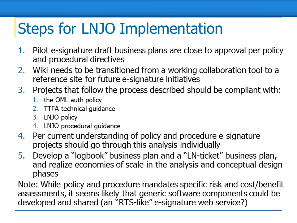
We’ve all been there. You have a complex process you need to teach, so the whole thing ends up on one slide. Is it realistic to expect your viewers to remember all the information on the screen long enough to apply it in their jobs? We can all agree that’s too big an ask. There has to be a better approach!

After: Job aid and scenarios using it
If you have a complex process, why not create a job aid that your viewer can access at the exact point of need? As an added bonus, once you’ve got that job aid in place, you can focus your training resources on creating scenarios where the learner can practice using the job aid in real-word situations! eLearningArt assets used: Business Casual Photo Characters and Cutout Office Objects.
Relevancy Tips from the Experts



Patti Shank, PhD
The best way I know to engage people in elearning is to solve genuine learning needs. How? Know their jobs. Ask questions about their projects. Then make it quick. Make it painless. Get them what they need, when they need it, in the form they need it. People are very busy and are getting even busier.
Patti is the Founder of Learning Peaks, a published author, and a frequent speaker at eLearning conferences. Patti is also a popular author on the ATD Science of Learning Blog, Learning Solutions Magazine, and her own blog. Learn more about Patti here.
Matt Guyan
There’s different types of engagement in eLearning – there’s the visual (the look and feel), the physical (meaningful interaction within) and most importantly the mental (stimulating thinking). While the first two are needed, if you really want to make eLearning engaging for people create something that’s relevant for them, arouse their curiosity, challenge what they know, have them make decisions with consequences and ultimately help them to perform better.
Matt is a Solutions Developer for B Online Learning. Matt has been so helpful in the Articulate forums that he’s been designated “Hero” status. He also delivers Articulate Storyline 2 training and facilitates a Master eLearning Course. Learn more about Matt here.
Clive Shepherd
The number one factor in engagement is relevance, because relevance drives out resistance. If a person has a need – to solve a current problem, to gain some personal advantage, to reduce a risk – then they will invest time and energy in meeting that need, even if that means working through some rather uninspiring e-learning. Obviously other elements come into play – storytelling, stretching but reachable challenges, engaging media – but without relevance the learner will pay them little attention.
Clive is the Founding Director at The More Than Blended Learning Company. He is a recognized thought leader and author in the eLearning space with over 30 years of experience in technology-assisted learning and communications. You can read more about Clive on his blog.
Jane Hart
Thinking you need to make your elearning more engaging, suggests that there is an issue with motivation to use it. People will only want to engage if it is relevant to their needs or helps them solve problems. So focus on understanding THEIR needs and providing them with the content that best suits those needs, in the format THEY want, to be used in the way THEY want – rather than creating stuff in the way YOU want and adding in gratuitous bells and whistles to make them use it in the way YOU want. It is the ability to have some choice and flexibility in how it is to be used that makes the difference.
Jane is a speaker, writer, and independent modern workplace learning advisor. She is also the Founder of the Centre for Learning & Performance Technologies, one of the world’s most visited learning sites.
Rod Ward
Most learners will find e-learning content ‘engaging’ if they see it as directly relevant to things they need to know, or tasks they need to perform. So rather than just making the content an ‘info-dump’, try to find out more about your target audience and then design the content to be a close fit for their specific needs. Don’t worry about the ‘bells and whistles’ of interactivity or graphic design until you know exactly how to address this issue. The other elements of the design can then flow from this need.
Rod in the Director of Infosemantics, an eLearning professional services company in Australia. Rod is well known in the Adobe community and has been designated an Adobe Community Professional (ACP). He excels at simplifying complex topics into layman’s terms. Read Rod’s advice about building interactive learning here.
Bruce Graham
The only way to make eLearning “engaging” (in my opinion…), is to make it “speak” to the learners, solving a personal or business problem or challenge that they have. That said, images speak louder than words. The bullet point is dead, the situation, or vision are king. Bryan’s backgrounds, templates and images provide for virtually every occasion, and I have used them to visually enhance hundreds of courses over the years.
Bruce is a Freelance Instructional designer specializing in Articulate Storyline, PowToon, and Video Scribe. He is well known in the Articulate community as a “Hero” and is often the first one to jump in to help other community members. Learn more about Bruce here.
Phil Mayor
It is important to think about the user experience and ensure that what ever you build can be picked up and used without giving instructions. Look at Tablet apps for inspiration, a six year old can pick up a tablet and use it without need instruction this is what you should be aiming for. Try and follow web conventions this makes it much easier for a user to navigate your course. Look at micro interactions as a way of simplifying the user experience and navigation.
Make it fun if at all possible, can you add in any easter eggs? This would make the user want to explore your course to see what else they can find!Above all make it relevant to the target market, if the user wants to learn and can see the purpose of the interaction they will be engaged.
Phil is the Creative Director of Elearning Laboratory. He is an Articulate Super Hero and award-winning eLearning developer. The best way to learn more about Phil is to follow him on Twitter.
Patti Bryant
My tip for creating engaging eLearning is simple – make it realistic and actionable.
For example, let’s say a property management company needs a “Leasing 101” course for Leasing Agents. One approach might be to provide a lot of detailed information about the company and walk through informational steps of how to lease a property, etc.
Instead of this approach, I believe we must immerse the learner in an experience where they will make real-life decisions. For example, the learner opens the course and sees a potential customer. They ask appropriate questions, look up floor plans, determine which units to show the customer, and find answers to questions they don’t know by looking up the information in a handbook.
It’s actually the simplest thing – we tend to over-complicate it. The most engaging eLearning mimics real life and allows learners to explore.
Patti is the CEO and Founder of Learning Reinvented where she focuses on creating behavior-changing experiences that solve business problems. Patti has over 8 years of training experience and holds an MA in E-Learning Instructional Implementation and Design.
Erik Lord
Make the content as relevant to the learners as possible. Whether that’s using particular references if you know the demographic, or a more generalized scenario for a broader audience, people like to pay attention to things that they find relevant to their own experiences.
The popularity of video platforms (i.e. YouTube) is largely due to people being able to find clips that are relevant to them within a huge library. How do we, as eLearning developers, tap in to that same enthusiasm for our training content?
What’s the story that needs to be told to get the concept across?
Is video the best medium or can we go with a more interactive solution that still involves some sort of story line?
Taking off your designer/developer hat, how would YOU like to learn about the material?
Erik is the Manager, Multimedia Production at DeVry Education Group. He is also an Adobe Community Professional. He has been in the eLearning profession since the term eLearning has been around. You can learn more about Erik here.
4. Add context to show the material in action
It’s important to know what’s relevant to the audience when they are at work, doing the things you’re training. This is the stuff you want to incorporate this into your program. We say skip the slick stock photos of generic places. Why? Because on-the-job situations and real-world environments affect actions — you want to account for that in your training. Add backgrounds that feel familiar, show objects and graphics that look like they would come from your viewers’ workplace, and employ characters that look like real people — in short, go true-to-life whenever possible.
Context Example
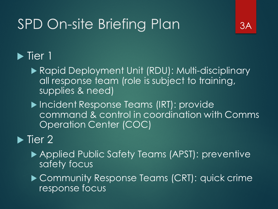
Before: Lots of text, without context
Text on a slides may be a way to deliver accurate information, but if it fails to connect with the viewer, the training will not deliver. If you were standing at a real crime scene, would it be easy to recall the Tier 1 and Tier 2 responses given here? Probably not!

After: In-context story similar to job
Instead of expecting text to translate to learning, first try to create scenes that look like the viewer’s world. From there, deliver the material that actually connects to that environment during on-the-job application. Bottom line: Deliver the details once the context is established. eLearningArt assets used: Specialty Photo Characters and Photo Backgrounds.
Context Tips from the Experts

Diane Elkins
Put your information into context. Think about some guy named Joe doing his job on some random Thursday in November. What situation will arise where he’s going to need to use the information you are presenting. Tell that story.
Diane is the Owner of Artisan E-Learning. She is an award winning designer and a frequent speaker at eLearning conference. She is also the author of multiple eLearning books. You can read more about Diane on the Artisan blog.
Cathy Moore
First make sure that elearning will actually solve the problem. Then, understand the problem–what do people need to DO? Help them practice doing it with realistic challenges, preferably spaced over time. That will make your elearning relevant and useful, which will make it engaging.
Cathy Moore is an expert in eLearning scenario design. Her goal is to save the world from boring training, which she does by consulting with organizations across the globe, writing for her own popular blog, and offering an amazing scenario design workshop.
Lesley Price
To engage learners there has to be a WIFFM – What’s In It For Me, so it’s not just about eLearning content, even more important is the context. If all that’s required is a quick job-aid, then provide it, don’t create click next learning. If however the learning is more complex, story-telling can be very powerful. Branching scenarios are a great way to provide information, allow people to make decisions, see consequences of their actions and learn both from getting it right and, more importantly, from making their own mistakes.
Lesley is a Senior Consultant at Learn Appeal and a Facilitator for #chat2lrn on Twitter. She specializes in analyzing complex situations and designing, implementing, and managing programs from a local to national scale. Follow Lesley on Twitter here.
Charles Jennings
If learning material, whether eLearning or other type, is designed to be highly relevant and delivered in context then it is likely to be useful. If you need to think about whether it is ‘engaging’ then you’re probably not doing it right.
Charles is the Co-Founder of the 70:20:10 Institute and the Senior Director, Enterprise Strategy of the Internet Time Alliance. Charles is an international keynote speaker and is recognized as a leading expert of 70:20:10 learning strategies. You can learn more about Charles here.
5. Incorporate media to create visual interest
Our viewers don’t work in a static world, so why should our slides be flat and strictly informational? Incorporating media into our eLearning programs doesn’t require fancy software or graphics. In fact a little ingenuity goes a long way! When you employ media in your programs, you create a diverse visual experience. Use real-to-life graphics in the programs you work in everyday, make the most of in-built tools for motion and effects, and you’ll get your message across with strength.
Effective Media Example
Before: Way too much for one slide
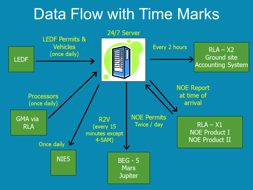
If you take a close look at this slide, you’ll see lots of back and forth communication with that 24/7 server (and don’t get us started on the old-style clipart used to represent it!), but do you get what’s happening, really?

After: Animated graphic instead
To build this scene, we took the same info from the Before slide, added a modern server backdrop, and brought in the actions and their timings one by one. We added some people, dressed to convey the nature of their work, too. With that, we have an added bonus: These same characters can be part of the reinforcing scenarios later in the program! Boom, how smart is that? Assets used: Designer Illustrated Backgrounds, Workwear Photo Characters, Medical Photo Characters.
Media Tips from the Experts

Tim Slade
The creation of engaging e-learning content is an intersection of great visual design and meaningful interaction. Exciting graphics help to pull your learners in, and meaningful interactions makes the learning memorable and effective.
Tim Slade is an award-winning eLearning developer and the Sr E-Learning Manager for Technical Products at GoDaddy. He’s authored several eLearning books, is a frequent conference speaker, and is a community “Hero” at Articulate. Learn more about Tim here.
Kevin Thorn
Engaging elearning doesn’t necessarily mean complex interactions. Keeping learners engaged has a lot to do with the overall design. Best tip: Spend equal to if not more time to the overall experience design with an emphasis on a good visual design.
Kevin is the Chief NuggetHead at NuggetHead Studioz. He’s an award-winning eLearning developer and an Articulate Super Hero. Kevin is also an amazing illustrator and a popular conference and workshop speaker. You can learn more about Kevin on his blog.
Steve Haskin
The easiest way to engage learners is visually. When you’re creating your training, think visually. Make visual thinking the first thing you do when you’re at the beginning stage. Keep it new. Create movement on the screen. This will keep your learner’s eyes moving and that will keep your learners engaged. The visual learning you create, along with the information your learners need to know, will have immediate payback in comprehension and will be retained later. We’re talking six months out. If you present your learners with the same old same old slides with data, they’ll tune out. You can lose your audience in the first 10 or so seconds if you don’t build in visual appeal and some visual surprises.
Steve is the Principal & Chief Creator at Industrial Strength Learning. He is an advocate of video and audio in training and coined the term “Photeo,” a style of imagery, that he uses in many of his courses. Steve is a frequent eLearning conference speaker and an author for eLearning Guild’s Learning Solutions Magazine.
Rick Zanotti
Put the “multi-” back into multi-media, which is what eLearning is all about. Use all forms of media at your disposal to engage and promote retention.
Rick is the President of Relate Corporation, an e-Learning and Training company. He also hosts the popular eLearnChat video series, where he has interviewed over 100 eLearning experts. You can learn more about Rick here.
Anita Horsley
Add a variety of multi-media and scenario based training
Anita is the Owner and President of CALEX Learning Consultants. She is well known in the Adobe Community as an Adobe Certified Instructor and Expert and an Adobe Community Professional. She holds a Masters’ degree in Education. You can learn more about Anita here.
Charles Hamper
I like to look at the overall idea (given in a short slide or paragraph) and try to build a visual system that mirrors that idea. This can be photos, a graphic, or even short text, making a map of the idea. The key is to keep it as simple as possible, so that it compliments the voice over instead of distracting from it.
Charles is a Media Developer for CHDS-VRC. He specializes in breaking down and presenting complex content in a useful and intuitive way. You can see samples of his animations, eLearning, and other work at Monterey Motion Graphics.
6. Incite emotion to connect on a deeper level
When’s the last time a list of bullet points pulled at your heartstrings? Never, right? Here’s the thing … most training is created because there are benefits to learning and applying the material (and consequences if that doesn’t happen). Too often, however, eLearning courses just push information to viewers instead of bringing it into their personal world. Paying attention to opportunities to convey the emotions associated with the material means you can signal these benefits and consequences in ways that they will be felt, not just heard, read, and forgotten.
Engaging Emotion Example
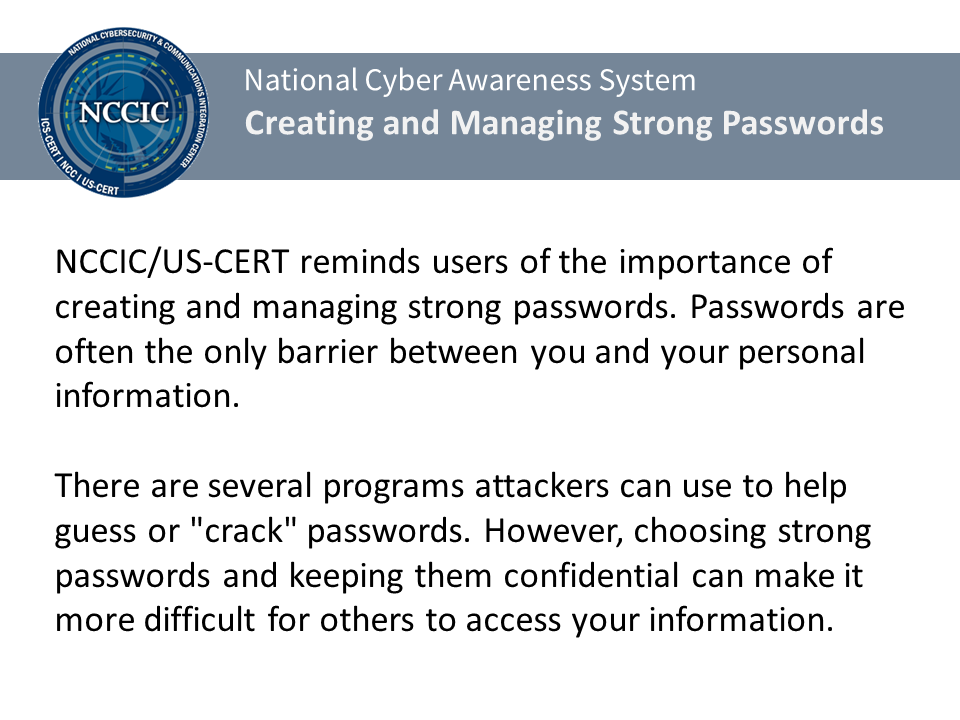
Before: Boring, factual, and easily-forgotten
Facts on a slide may provide true and good information. But they are not very memorable. What’s in it for the learner? Maybe they care while they’re reading, but what makes the information sticky? If info on a slide isn’t remembered once the viewer is done with the program, it’s not going change what they do when they are back on the job after the training.

After: Consequences tied to emotion
Most training exists because there are consequences of not implementing the material or benefits if they do. Pull that to the front! Connect the benefit or consequence to the emotion the viewer will feel. Let a character stand in for the viewer, and tell the story of how it feels when mistakes are made or policies aren’t followed. Not having a strong password could lead to some really bad outcomes. Show your viewer how that feels. eLearningArt assets used: Business Casual Photo Characters.
Emotion Tips from the Experts
Mike Taylor
Think like a marketer. Like marketers, we are also trying to gain attention and motivate people to action. The marketing approach is very different and usually much better. Respect the fact that there are a lot of other things competing for the attention of your audience. Focus your learning and pare it down to its simplest, clearest, easiest-to-understand form. Invoke emotion. Make it fun, sexy, interesting, mysterious, etc so that they WANT to learn more about your topic. Use appealing visuals to help you achieve those goals.
Mike is a learning technologist at Mindset Digital, as well as a former Community Manager at Articulate. He is also a frequent eLearning conference presenter and expert eLearning blogger. You can learn more about Mike on his blog.
Lieve Weymeis
A learner is a human being. This means that learning is most effective when invoking emotions and facilitating peer collaboration. That doesn’t necessary mean ‘gamification’! Humor, story telling, facilitating communication between learners by social media or – if possible – IRL will reinforce the learning climate. Boredom and solitude are THE enemies of all learning methods, but even more for eLearning.
Lieve is a Freelancer at Lilybiri Consultant Trainer. She is an Adobe Community Professional, where she is well know as “Lilybiri” and is often the first to respond to just about every question asked! Lieve posts frequent tutorials on her blog.
Jennifer Valley
Think like a learner! What draws in your attention? Makes you sit up in your chair? Whatever it may be, use it to your advantage in eLearning.
Jennifer is the Community Manager at Trivantis, the company behind the Lectora eLearning authoring tool. She brings her experience in eLearning development and instructional design to empower the Lectora community to build better eLearning. Check out the Trivantis community here.
Mark Britz
Advances in technology have often distracted elearning professionals from what lies at the core of an effective learning experience – an emotional connection. Emotion is tapped through story, conversation, experience and opportunities to reflect (group or personal). These are the elements that have led to effective learning for over 10,000 years and although technology can enhance our learning it cannot change how we learn. My tip then – provide opportunities for an emotional connection to the content; invite conversations, create associations to personal experiences, and provide opportunity to practice and reflect upon that practice with others.
Mark is a performance strategist and the Senior Manager of Programs for the eLearning Guild. He’s also a frequent eLearning conference presenter and blogger at The Simple Shift. I also had the pleasure of being on Mark’s eLearning simulation development team at SmartForce 16 years ago!
7. Tell a story about the learner’s world
The abundance of new movies and television shows every year proves that stories are memorable and engaging. Why not use stories in learning? Doing so gives you an opportunity to tie content to context. You can weave a story that elaborates on the nuances of real situations employees in your organization face, making relevant examples come to life without naming names. Like scenarios, these stories can be followed up with opportunities for viewers to explore possible outcomes, endings, and consequences.
Story Example
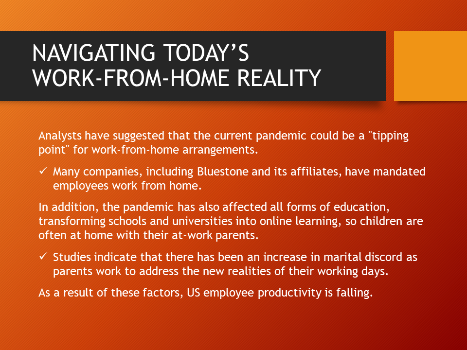
Before: Text with information
This text-heavy slide on a working-from-home course is a snoozefest! How about flipping the content around into a story about the real conflicts your employees would face when they work from home? No need for a fancy screenplay with a plot and story arc! Just come up with a relatable story that connects your learner to the content by showing the real-world context of the material. Much better (and easy)!

After: Story connecting to real life
When your program describes something that everyone can relate to, skip the text and jump directly into a story. Starting there means your viewer knows exactly what you’re referring to and they’ll be interested to learn more. It’s all because you’ve told a story about their world. eLearningArt assets used: Business Photo Characters, Phone Photo Characters, Academic Photo Character, and elements from the Build Your Own Backdrop System
Want to see more examples like this? View our eLearning story examples.
Story Tips from the Experts
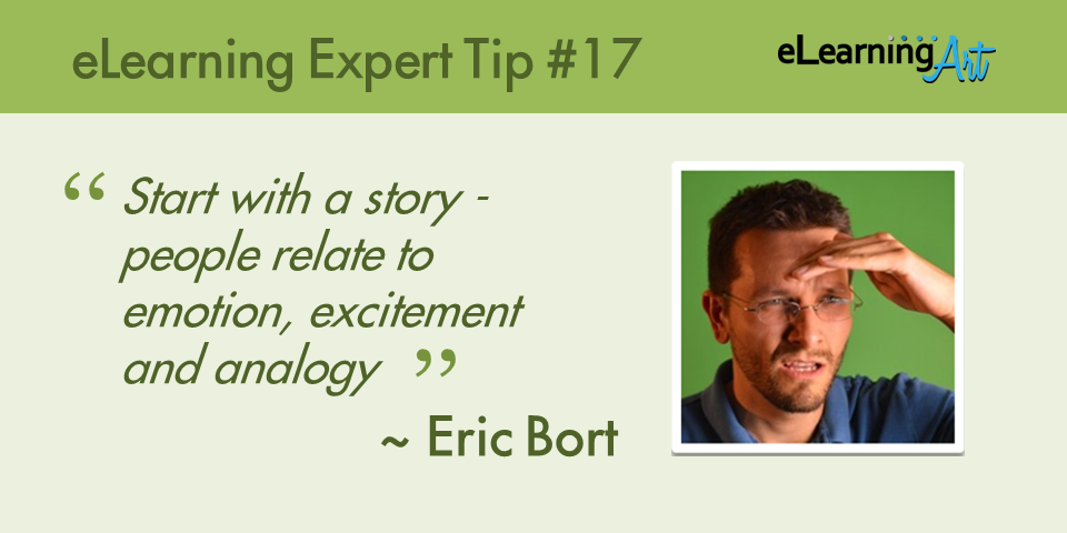
Eric Bort
Start with a story – people relate to emotion, excitement and analogy a lot better than robotic bullets and a content dump. Writing a great story vs. a dull script usually costs about the same in time and effort as well – it’s the least expensive way to get the most memorable impact out of your training.
Eric is an award-winning eLearning developer and the President of Clearly Trained. His projects have reached massive scale, being viewed by over 100 million unique users. If you’re looking for design inspiration or need some help with your custom development, check him out over at Clearly Trained.
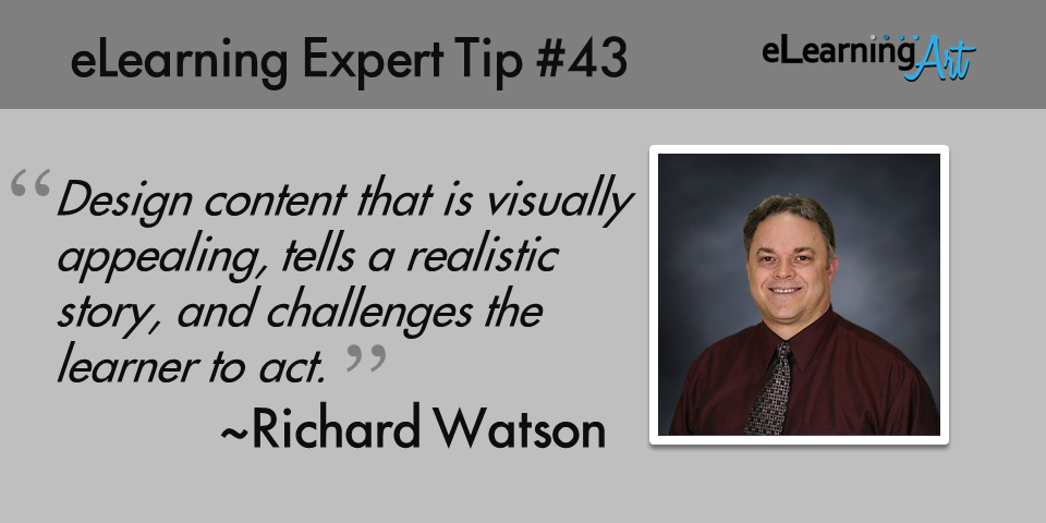
Richard Watson
Design content that is visually appealing, tells a realistic story, and challenges the learner to act. To truly engage learners, they need to be able to navigate your content easily, to be absorbed into a story that is relevant/meaningful from their perspective (e.g., point of view, language, character, environment), and to be challenged to make decisions. Once a learner is interacting with the story and making decisions along the way, their struggles will become opportunities to engage them even more with feedback.
Richard is the President of Bridgehill Learning Solutions. He is an experienced eLearning and instructional designer who believes in taking a collaborative approach with clients on projects. He’s also known in the Articulate community as someone who is both helpful and generous. Learn more about Richard here.
8. Put the learner’s experience first
Your job as an instructional designer or eLearning developer is to put yourself in the shoes of the learner. What does their day look like? What are the problems or pain points they run into? How can you make their job easier and their days better? When you prioritize learning more about your learners, you’ll find that you can infuse your program with choices that target the learning experience more precisely and effectively.
Learner First Example
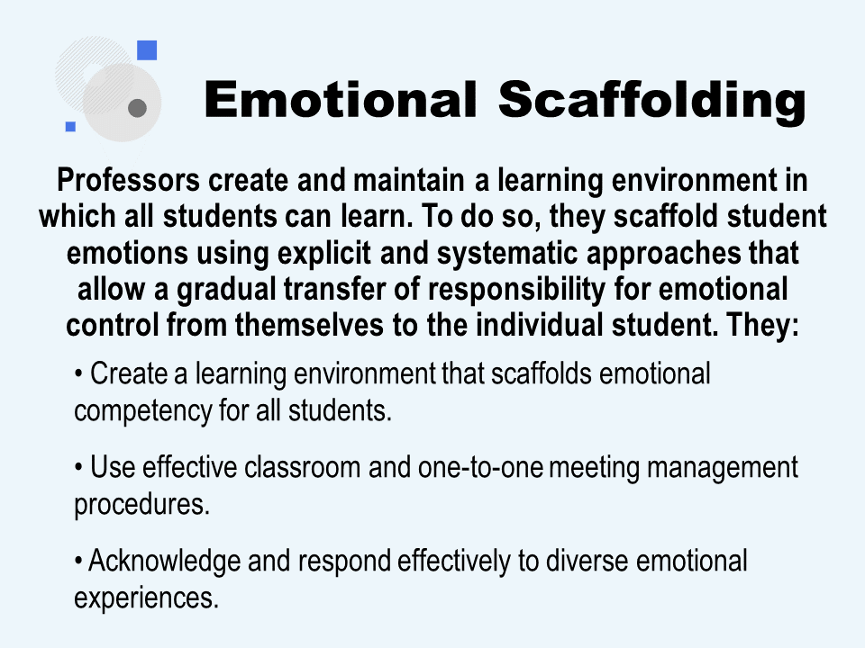
Before: Theoretical but flat
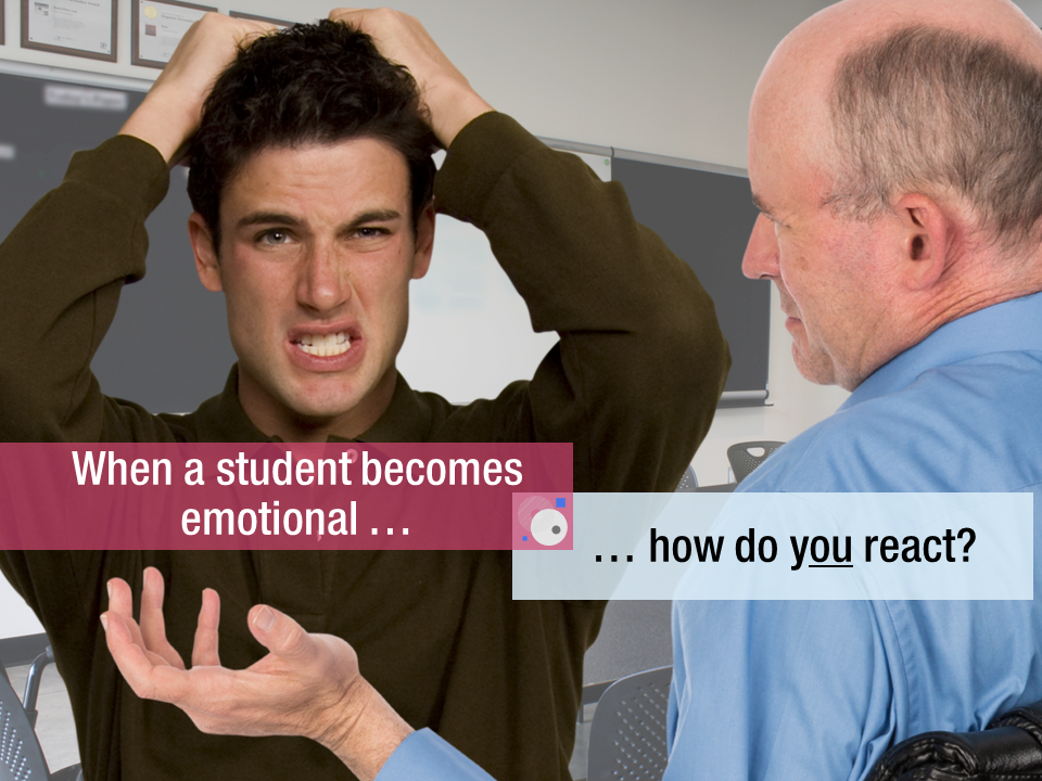
Sure, information can be interesting, but it’s not information that makes your learner’s workday better. In this example, a professor probably doesn’t care about the theory of emotional scaffolding. It just feels like more useless information that doesn’t help them. That equates to one word: Forgettable.
After: Practical, real-life use
What is it that a professor would care about? Easy: Avoiding or de-escalating a conflict with a student. While the content you include can be very similar, you’ll engage with your learner and make it memorable if you deliver the message from your viewer’s perspective. eLearningArt assets used: Business Casual Photo Characters, and Photo Backgrounds.
Learner First Tips from the Experts


Eric Tremblay
Learners don’t want to learn from machines. They want to learn from expert humans who leverage technology effectively. When thinking about eLearning or online learning, stop thinking about technology to “replace” human instructors and start thinking about technology to “enable” human instructors.
Eric is the Manager of Online Learning and Development and an Adjunct Professor at Queen’s University. Eric is a Certified Instructional Designer and also holds an MSc in Pharmacology and Toxicology and an M.Ed in Adult Education and Distance Learning. Learn more about Eric here.
Jane Bozarth
Don’t just start loading content onto slides. Before you begin, step away from the computer and ask, “How can I help people learn this?” Look for an interesting treatment, narrative, theme, or story to help learners get the material while being presented with an interesting setup that supports a sense of accomplishment and forward motion.
Jane is the author of several popular eLearning industry books, frequently writes for eLearning Guild’s Learning Solutions Magazine, and is a regular speaker at conferences. She’s also an eLearning Coordinator for the State of North Carolina. Learn more about Jane at her blog.
Bianca Woods
Know your audience! Great eLearning design isn’t universal, so what might work fantastically for one audience may completely tank with another. By getting to know more about the audience you’re designing your eLearning for, you can customize what you create to their actual needs. Start with questions like what do they already know about this topic, how does this topic fit into their real work, what about the topic are they struggling with, how have they responded to eLearning in the past, and what setting will they be accessing it from – anything that helps you see things from their perspective.
Bianca is an Advisor, Design and Communications for BMO Financial Group. She holds an MS in Education Media Design and Technology and is passionate about both teaching and technology. Learn more about Bianca here.
Julie Dirksen
The best thing you can do to make learning more engaging is to give people the opportunity to do something with the learning right away. I’ll sometime ask people to rate their interest in a video on printer repair. The answer is zero. Then I’ll ask people to rate their interest in the video if I put a broken printer in front of them, and the number goes up. If people have something they themselves need to print, then their interest gets very high. It’s the same video in all three scenarios, but the engagement is very different.
Julie is a well known eLearning author and speaker. She is a Learning Strategy Consultant for Usable Learning. She also holds an MS in Instructional System Technology. Julie’s book, Design for How People Learn, is a must read for every instructional designer. Learn more about Julie here.
John Blackmon
Rather than having a series of “read and click next” type pages, allow the user to explore the content in the way that’s right for them. Give them a way to traverse the material in a non-linear fashion so that they aren’t just viewing a presentation. Consider adding in gamification methodologies into the navigation that rewards the consumers of your content for getting through each area of the course. This not only makes the information more interesting, it also can allow for the material to be used as performance support, as any section can be referenced when needed.
John is the Chief Technical Officer at Trivantis, the company behind the Lectora eLearning authoring tool. You can learn more about John and connect with him here.
Kristin Anthony
Honestly, I think the best way to make elearning engaging is to create or curate the content that motivated people to get stuff done and remove as many barriers as possible. Trying to motivate people may well be a highly overrated task. Instead, focus on helping people do the things they want to be able to do and getting rid of, or providing efficient pathways through the things that get in their way. Designing for stress cases and moments of need are excellent frameworks.
Kristin Anthony is an Instructional Designer at Planview. She frequently shares her thoughts and examples on her blog and is the host of the “Dear Instructional Designer” Podcast.
Connie Malamed
Interview sample audience members and find out how the training or education fits in to their world. Discover their challenges and obstacles at work or at school. Identify their real-world needs. When you get to know the audience and empathize with their feelings, their thoughts and their environment, things will fall into place. You will know how to make things engaging because you understand your audience and you can connect with them… person to person.
Connie, known online as the “eLearning Coach,” is the author of Visual Design Solutions, a top rated eLearning design book. She has also been consulting independently for nearly two decades, with a focus on online learning, visual and information strategies and design. Learn more about Connie here.
Brian Allen
Think about if you had your learner in person, what kind of interaction would you use to make your learning more engaging… Coaching? Hands-on exercises? Practice activities? THEN, armed with those ideas, find creative ways to build it into your eLearning course.
Brian is a Design and Technology Consultant for Lexis Nexis. He is known for creating modern and engaging learning experiences. He’s also recognized as an Articulate community “Hero.” You can learn more about Brian and connect here.
Melissa Milloway
The best thing that you can do is invest in your professional development. Build your skills; whether it be in creating multimedia, developing with code, or designing scenarios and storytelling. Specialize in something and team up with colleagues who have different strengths. Everyone has a strength that they can further develop to add to creating effective and engaging learning. I often see Learning Professionals who forget about their own learning, that’s the biggest mistake you can make.
Melissa is a Sr Instructional Designer at Amazon.com. If you’ve visited the Articulate Hero’s forums, you’ve probably seen some of her awesome examples, tips, and helpful responses. She also shares numerous helpful posts on her LinkedIn author page.
9. Add interactivity to draw the learner in
eLearning provides a unique medium where you can easily build and deliver opportunities for learners to acquire significant amounts of information. Through interactions, you can use imagery to enhance the design and learning experience and encourage exploration. With the capability of creating engaging interactions built right into most authoring tools, boring learning programs can — and should — be a relic of the past! Make the most of eLearning’s interactive possibilities.
Interactivity Example

Before: Too much info on one screen
It’s a true fact that authoring tool default settings encourage us to show information as indented bullet point lists. When we pack too much in, it’s easy to end up with an overwhelming slide like this. It’s easy to take that same information and simplify the design, while preserving the clarity of the information and allowing the viewer to take their time absorbing it.

After: Reduce text via click to reveal
Click-to-reveal graphics offer a great (and simple to build!) form of interaction. They let you reduce, organize, and “chunk” on-screen text for better learning outcomes. Here, we’ve also included a human element — the second character acknowledges that its OK to be a little confused by the material. Will we use these characters elsewhere in the program, building in a little workplace story? You can bet on it! eLearningArt assets used: Designer Realistic Illustrated Characters.
Interactivity Tips from the Experts
Linda Lorenzetti
Make the course as interactive as possible. You want to grab their attention and hold their interest. The more they interact with the course, the more likely they will retain the information that they learn.
Linda is the Senior eLearning Developer at Public Services Health & Safety Association. She’s a frequent conference speaker and has built countless eLearning modules for both her organization and their clients. Her projects are often featured in the Articulate community. Learn more about Linda here.
Articulate Community Team
“Entice your learners to take action by inviting them to explore. Not many of us can resist the urge to poke around a new environment; humans are naturally inquisitive. What do we do when we walk into someone’s house for the first time? We take a look around to get a feel for what the person likes, how the person lives, and what we might have in common with them. Most of us wouldn’t feel comfortable peeking inside a friend’s cabinets without good reason. But we might be tempted to look because we might find something interesting or unexpected. Build interactions that your learners want to explore, that entice them to discover content out of curiosity.”
The Articulate Community Team is comprised of some of the world’s top eLearning experts. If you’re interested in learning more about building engaging eLearning, you should read their free ebook on the topic.
10. Use micro learning to deliver key messages
Micro learning — the delivery of learning objectives through the medium of very short programs — allows your viewers to acquire information they need in small and absorbable bites and to do so on an as-needed basis. To achieve the promise of micro learning, understand your audience well. Learn the typical spots where problems arise in regard to the topic at hand and target your micro learning there. Also consider where reminders — of steps, decision frameworks, and other repeatable actions — are most needed. You can provide just-in-time instruction for these situations through micro learning.
Micro Learning Example
Before: Boring presentation format
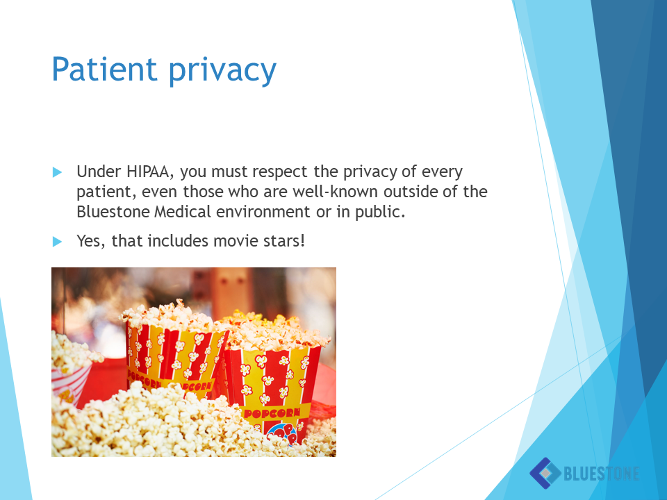
So your SME handed you a slide like this from their sleep-inducing two-hour presentation deck and you’ve been asked to convert the whole thing to eLearning? When you get slides like this, look at them carefully and consider what the key takeaway might be. Isolate that, and you’ve got the gist of your micro learning! Rather than creating a long course regurgitating the same content in the presentation, why not take each of the main points and flip facts into micro-stories?

After: Mini-scenarios in work context
In this medical compliance example, we take a realistic situation about a celebrity check-in at a hospital, tell that story, and create choices and consequences the audience would face in the real world. In just a few minutes, a viewer is reminded of the key takeaway from the original SME slide. eLearning assets used: Medical Photo Characters, Medical Backgrounds, and Scenario Templates.
Micro Learning Tips from the Experts

Dave Richards
The new aspiration is for the course to be delivered in a system that includes content intelligence so it can adapt to the learner based on what outcomes are desired.
Also, everyone is busy, so you better find a way to short form the content to a series of mini modules that can each be consumed in under two min.
Finally, never miss an opportunity to bring real-world experience into the mix and provide learners with immersive concepts, sounds, graphics animations, etc., that will lower the cognitive load and provide a bit of infotainment.
Dave is the Founder of RISEcx and an award-winning eLearning developer. He’s also hosted me in backyard olympics at his house outside of Portland, Oregon (I won’t say who won). Dave is an all-around creative guy and the courses he produces are inspirational. Learn more about Dave here.
Wendy Wickham
Keep it short. Small, relevant chunks. 3 minutes or less.
Wendy is the Principal of Middle Curve Consulting and has over 13 years of IT and training experience. Wendy is recognized as one of the top eLearning bloggers with her Middle of the Curve blog.


